Industry
Banking
Client
Santander Consumer USA
Enhancing Agent's User Experience with the loan origination system.

Project Overview
The Loan Origination System (LOS) is an internal platform used by agents to review loan applications, verify documents, and make loan approval decisions. The original system was built on outdated Windows Presentation Foundation (WPF) software, which made it sluggish, difficult to maintain, and hard to scale.
As part of a broader modernization initiative, engineers were migrating the backend to a web-based platform. My task was to redesign the user interface and experience to align with this new infrastructure and enhance agent productivity.
Business Goals
Modernize the Agent Portal
Transition from an outdated desktop interface to a responsive, web-based experience.Improve Agent Efficiency
Reduce cognitive load by simplifying navigation, improving information hierarchy, and streamlining workflows.Increase Transparency
Introduce a new dashboard feature to provide real-time performance insights for agents and stakeholders.Deliver Under Tight Timeline
Complete and launch the redesigned system within a 4-month development window.

UX Research
Discovery & Research
To identify the major usability issues, I began with a heuristic evaluation of the existing system. I also conducted user interviews with both Agents and Managers to gather insights into their pain points, goals, and expectations.The portal’s interface was cluttered and difficult to navigate, leading to a high cognitive load and poor usability. Key information was buried under dense layouts, overlapping pop-up windows, and inconsistent design patterns that hindered focus and readability.
Onboarding was especially challenging due to the lack of centralized documentation—both new and existing agents had to repeatedly relearn the system.
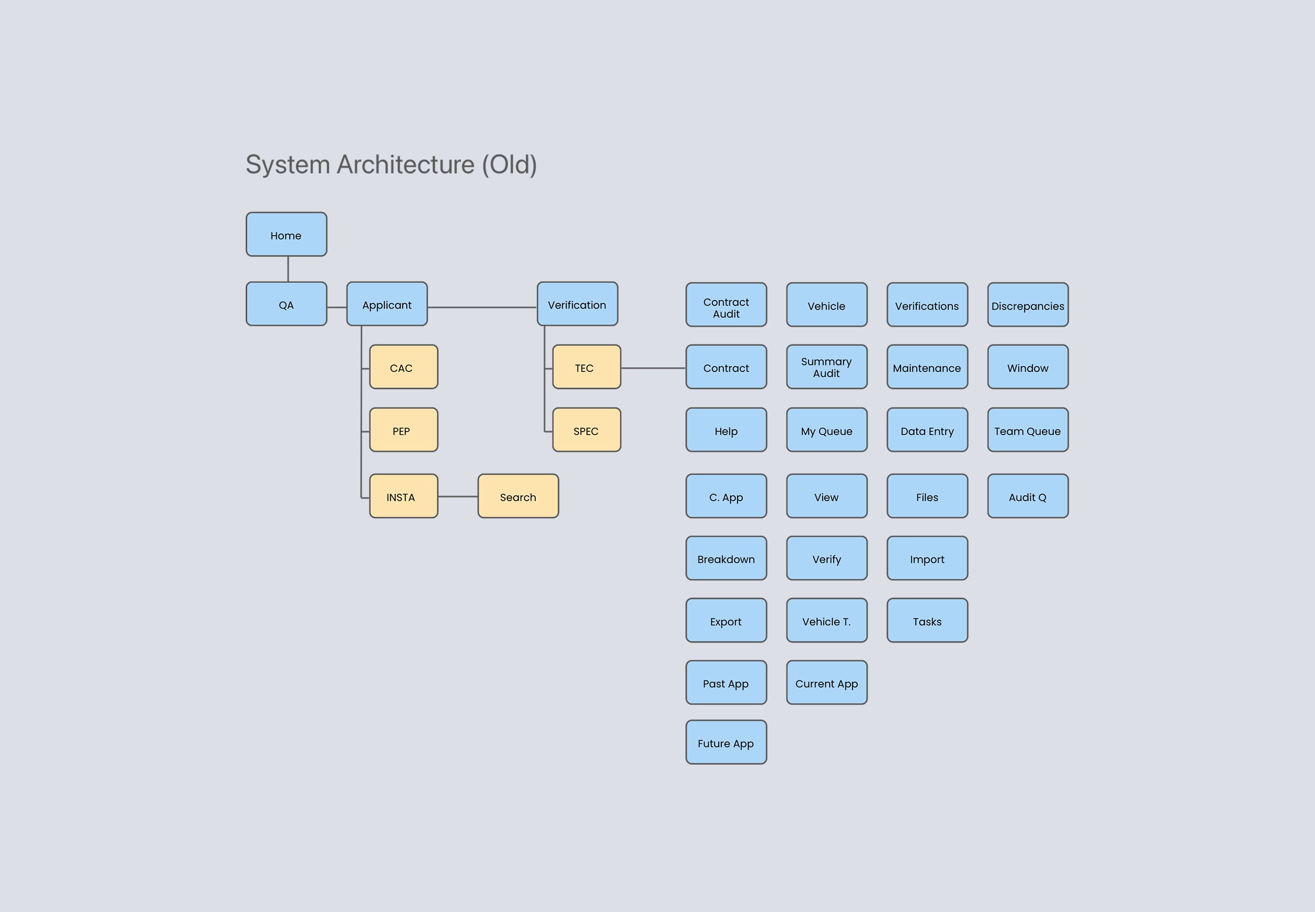
Through interviews, we learned that many tabs and screens were either unused or unclear in purpose. Agents often didn’t know what certain sections were for. We interviewed developers who revealed that outdated features had been left in the portal over time without being removed, contributing to interface bloat and further confusion.
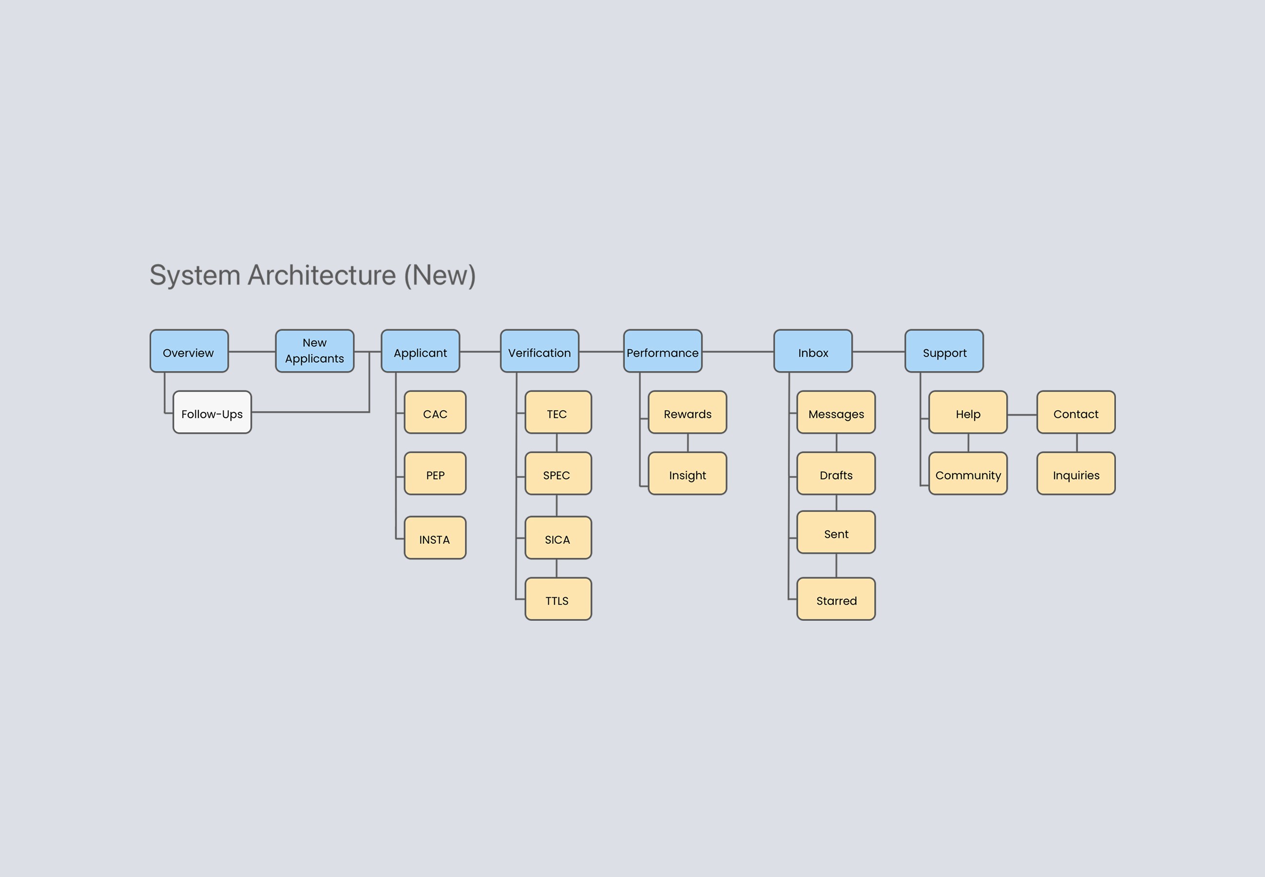
Defining the User Flow
Based on research findings, I restructured the user flow to prioritize frequently accessed features. This improved navigation and reduced the time agents spent searching for information.
UX Research
Discovery & Research
To identify the major usability issues, I began with a heuristic evaluation of the existing system. I also conducted user interviews with both Agents and Managers to gather insights into their pain points, goals, and expectations.The portal’s interface was cluttered and difficult to navigate, leading to a high cognitive load and poor usability. Key information was buried under dense layouts, overlapping pop-up windows, and inconsistent design patterns that hindered focus and readability.
Onboarding was especially challenging due to the lack of centralized documentation—both new and existing agents had to repeatedly relearn the system.
Through interviews, we learned that many tabs and screens were either unused or unclear in purpose. Agents often didn’t know what certain sections were for. We interviewed developers who revealed that outdated features had been left in the portal over time without being removed, contributing to interface bloat and further confusion.
Defining the User Flow
Based on research findings, I restructured the user flow to prioritize frequently accessed features. This improved navigation and reduced the time agents spent searching for information.
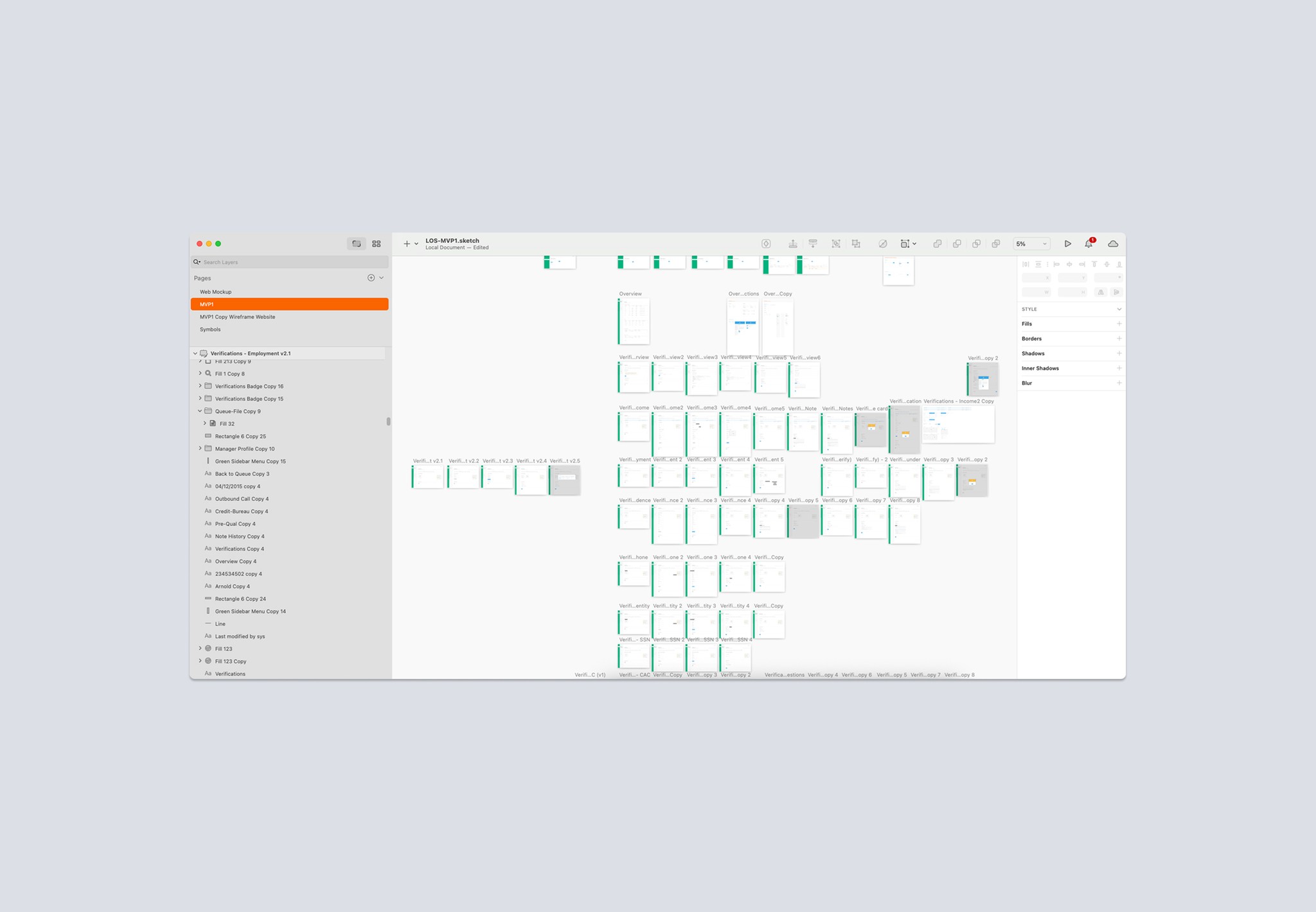
Wireframing & Prototyping
I created wireframes to map out the new interface and user interactions. These were prototyped using InVision to test functionality and gather feedback on usability, accessibility, and design coherence.


Outcome
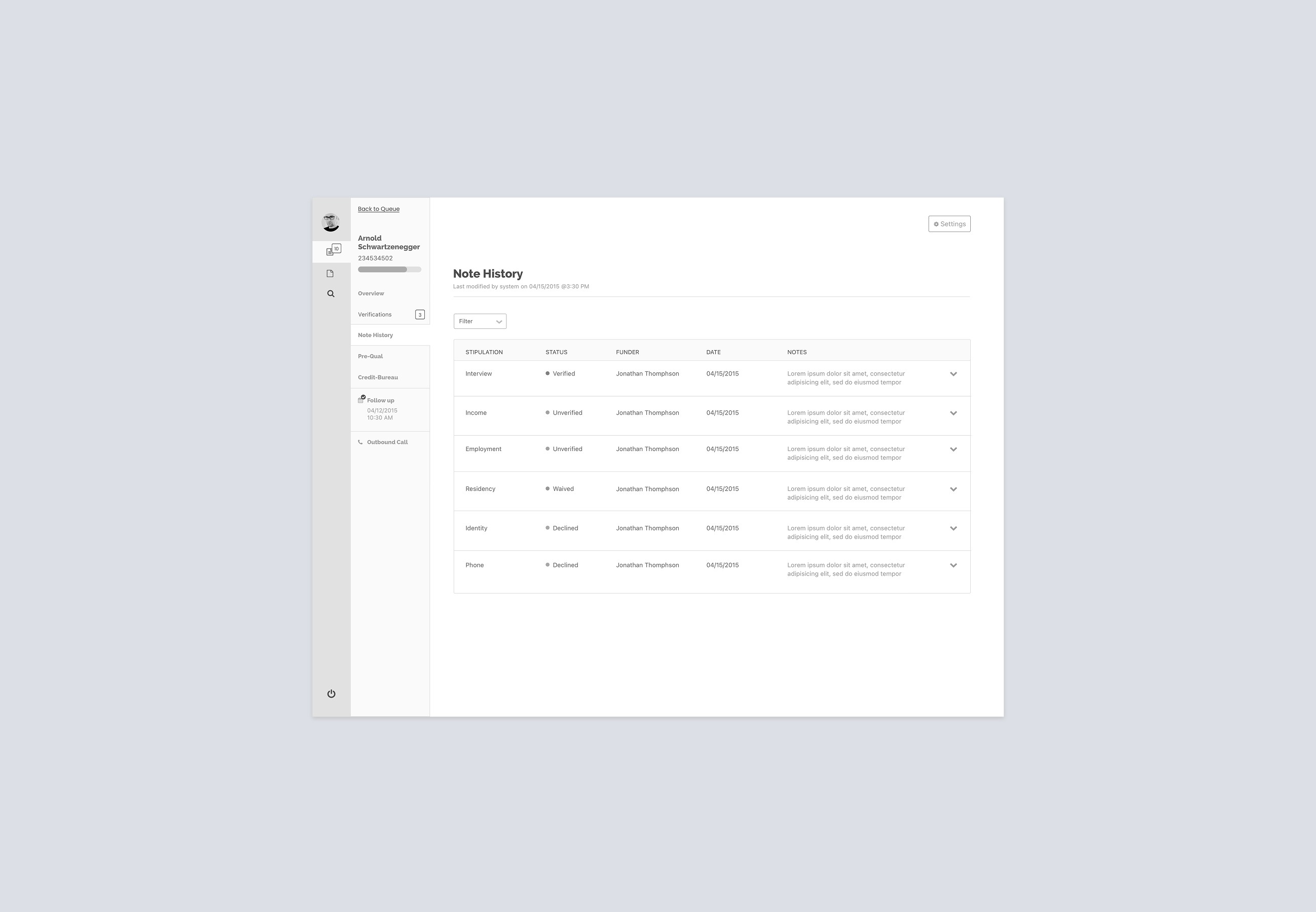
Once the wireframes were validated, I developed high-fidelity designs focusing on visual clarity, layout consistency, and intuitive workflows. The redesign emphasized usability by transforming overlapping windows into clean, sequential pages.
Streamlined Workflow
The redesign significantly reduced screen clutter and repetitive actions, allowing agents to complete tasks with fewer clicks and less friction.Improved Navigation
Information was reorganized to match agent priorities, making the interface more intuitive and reducing cognitive load.Dashboard Innovation
A new dashboard view was introduced to give agents and managers a real-time overview of tasks and performance. This replaced the manual, print-based reporting process and increased transparency across teams.Enhanced Usability & Accessibility
The new interface adhered to accessibility best practices, improving readability and overall user satisfaction.On-Time Delivery
The project met the stakeholder’s expectations and was completed within the 4-month deadline.
Outcome
Once the wireframes were validated, I developed high-fidelity designs focusing on visual clarity, layout consistency, and intuitive workflows. The redesign emphasized usability by transforming overlapping windows into clean, sequential pages.
Streamlined Workflow
The redesign significantly reduced screen clutter and repetitive actions, allowing agents to complete tasks with fewer clicks and less friction.Improved Navigation
Information was reorganized to match agent priorities, making the interface more intuitive and reducing cognitive load.Dashboard Innovation
A new dashboard view was introduced to give agents and managers a real-time overview of tasks and performance. This replaced the manual, print-based reporting process and increased transparency across teams.Enhanced Usability & Accessibility
The new interface adhered to accessibility best practices, improving readability and overall user satisfaction.On-Time Delivery
The project met the stakeholder’s expectations and was completed within the 4-month deadline.


