Industry
Home Services
Client
Neighborly
One Portal, Total Convenience
Project Overview
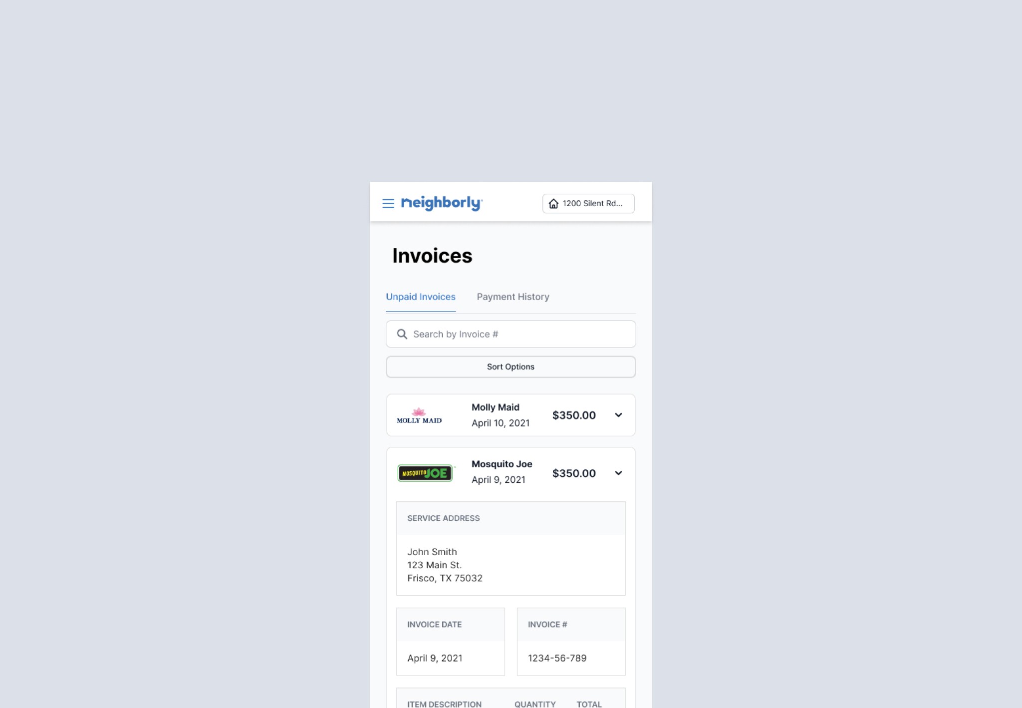
The Neighborly Customer Portal is designed to be a centralized hub where customers can manage all their home service needs across Neighborly’s network of over 20 franchise brands. Each franchise operates its own point-of-sale (POS) system, and this portal unifies those systems into a single experience for the customer.
With the portal, users can pay for services, view job and payment history across multiple franchises, manage appointments, and access personalized offers—all in one place. It’s built to simplify service management and provide a consistent experience, regardless of which Neighborly brand a customer interacts with.
Project Overview
The Neighborly Customer Portal is designed to be a centralized hub where customers can manage all their home service needs across Neighborly’s network of over 20 franchise brands. Each franchise operates its own point-of-sale (POS) system, and this portal unifies those systems into a single experience for the customer.
With the portal, users can pay for services, view job and payment history across multiple franchises, manage appointments, and access personalized offers—all in one place. It’s built to simplify service management and provide a consistent experience, regardless of which Neighborly brand a customer interacts with.
Usability Study
We conducted a usability study using Maze to identify friction points and opportunities to improve the Customer Portal experience. Insights from user behavior and feedback guided design decisions aimed at increasing usability, confidence, and adoption.
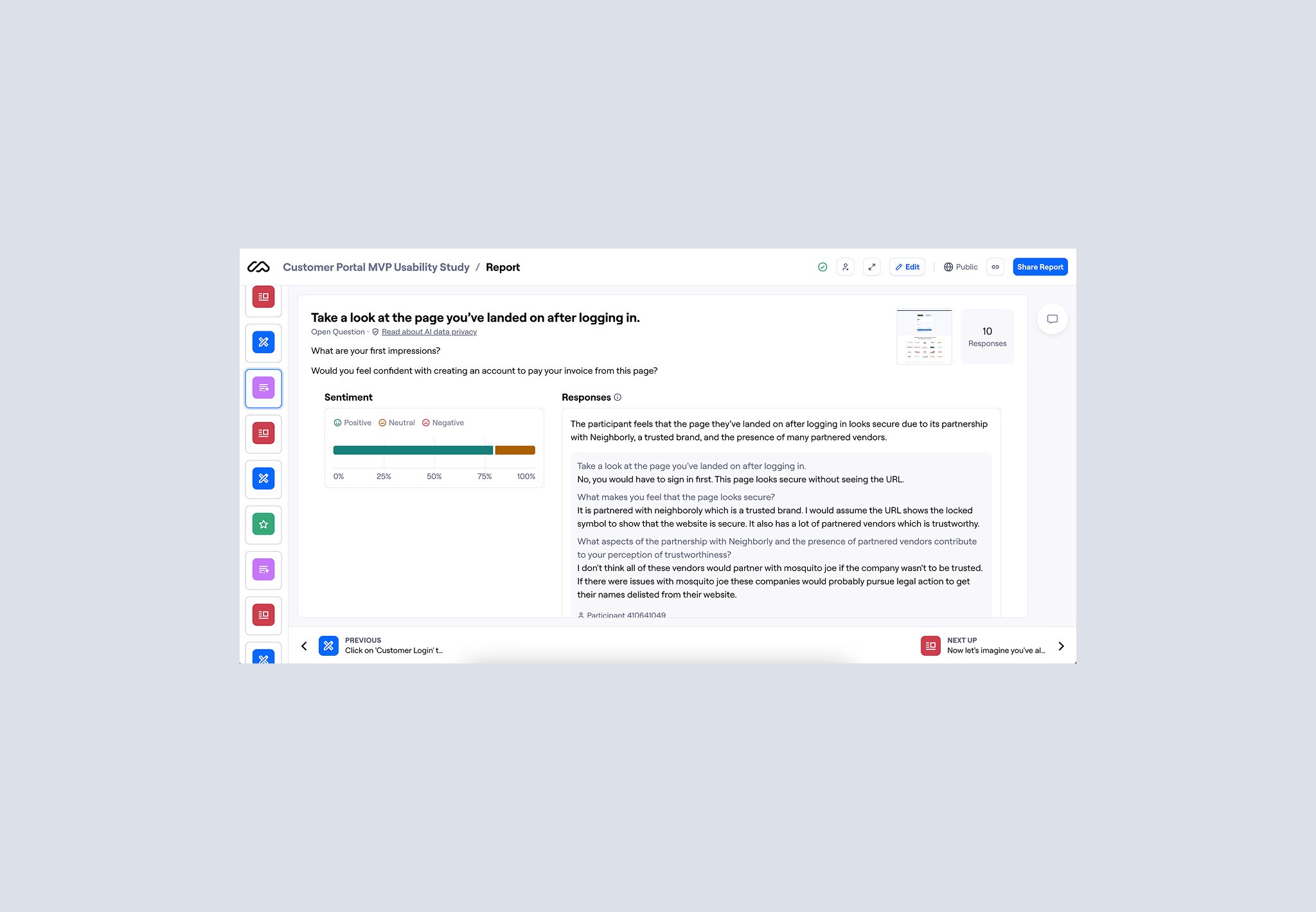
A key focus was the login experience—specifically how users responded to the transition from Mosquito Joe to Neighborly, whether they understood the brand relationship, and if the change impacted their trust or willingness to proceed.
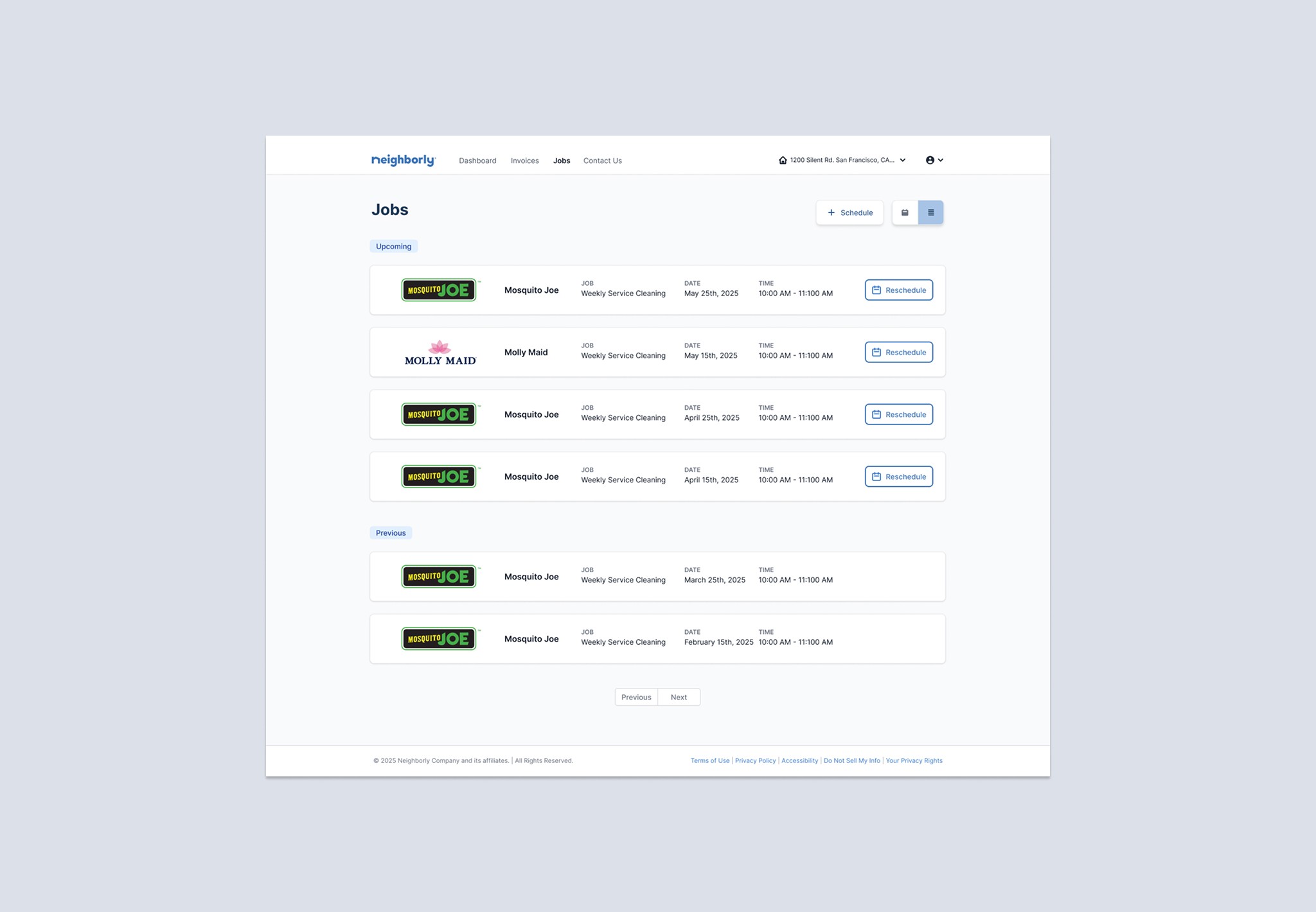
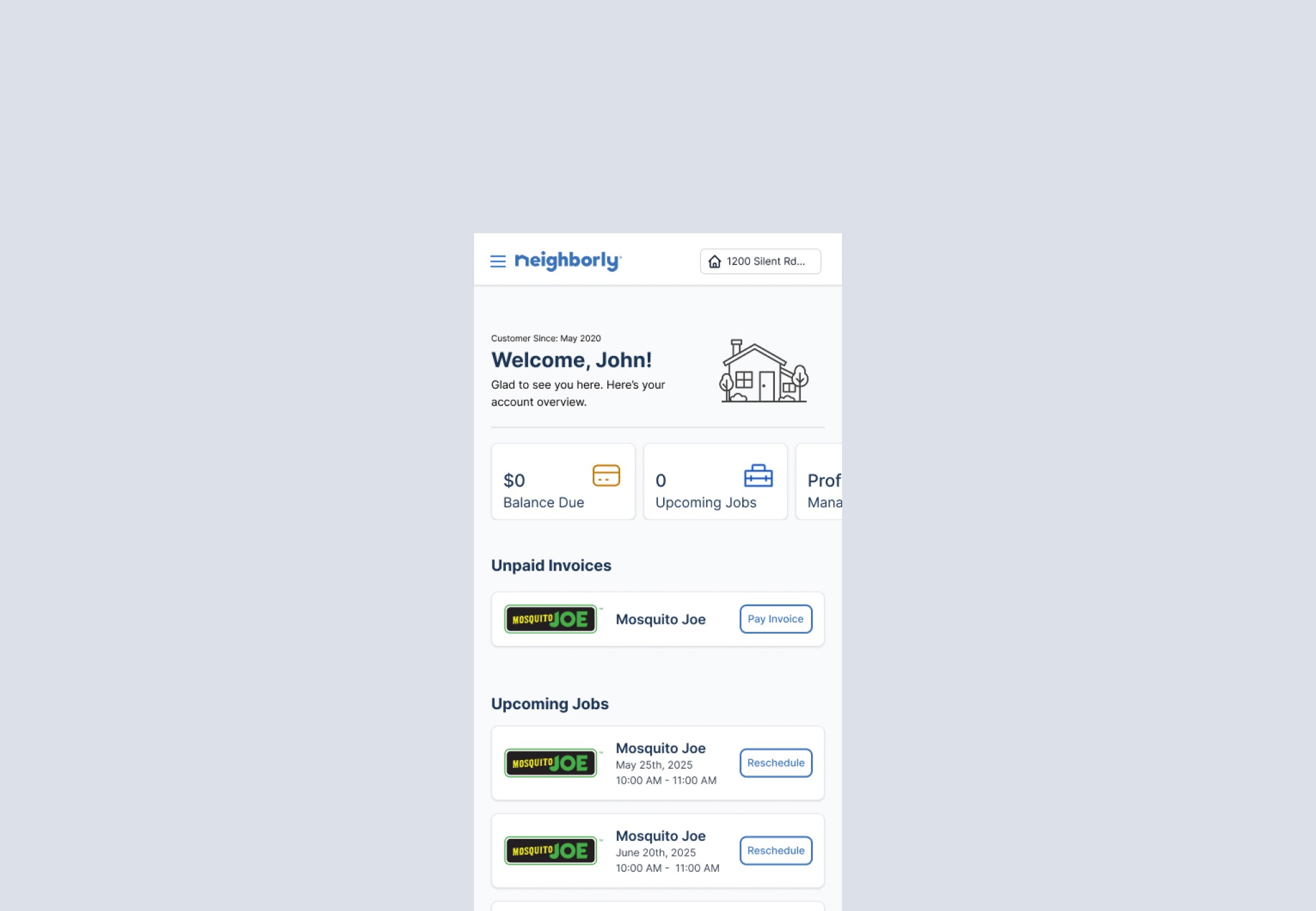
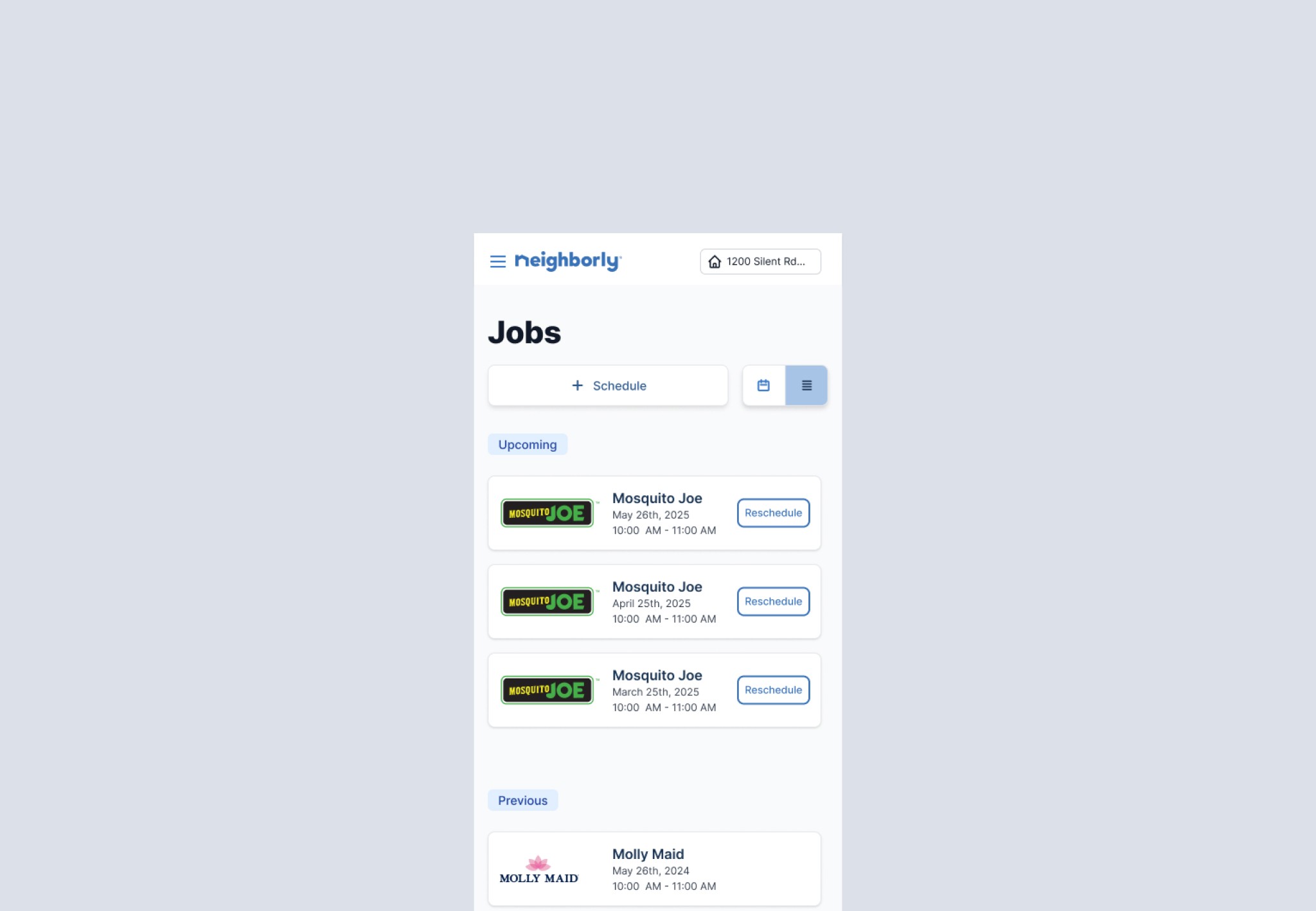
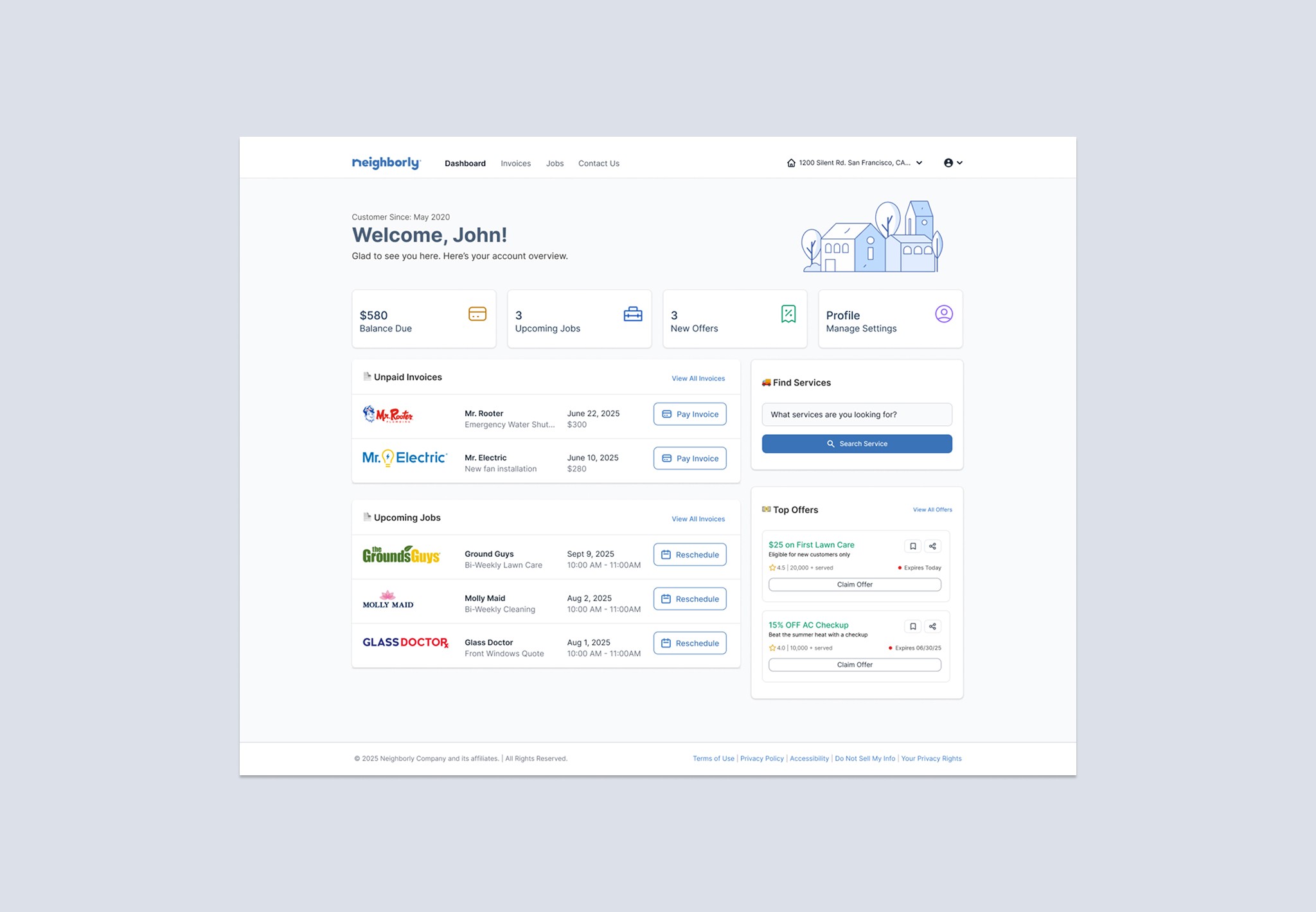
We also tested core interactions across the dashboard, including whether users recognized quick action cards as clickable, understood the “Jobs” label as referring to upcoming services, and could easily switch between properties to view job and payment history.
Additionally, we explored user preferences between list and calendar views for scheduled services and evaluated the perceived value of the account summary. Throughout, we focused on ensuring the portal felt intuitive and consistent—even as branding, terminology, and layout differed from what users may have previously experienced.
Usability Study
We conducted a usability study using Maze to identify friction points and opportunities to improve the Customer Portal experience. Insights from user behavior and feedback guided design decisions aimed at increasing usability, confidence, and adoption.
A key focus was the login experience—specifically how users responded to the transition from Mosquito Joe to Neighborly, whether they understood the brand relationship, and if the change impacted their trust or willingness to proceed.
We also tested core interactions across the dashboard, including whether users recognized quick action cards as clickable, understood the “Jobs” label as referring to upcoming services, and could easily switch between properties to view job and payment history.
Additionally, we explored user preferences between list and calendar views for scheduled services and evaluated the perceived value of the account summary. Throughout, we focused on ensuring the portal felt intuitive and consistent—even as branding, terminology, and layout differed from what users may have previously experienced.

Test Results
Overall impressions were positive—8 out of 10 participants responded well to the transition from Mosquito Joe to Neighborly during login.
Task success was strong across the board: users had a 100% success rate completing key tasks like using the dashboard quick actions, navigating via the “Jobs” label, and switching between properties.
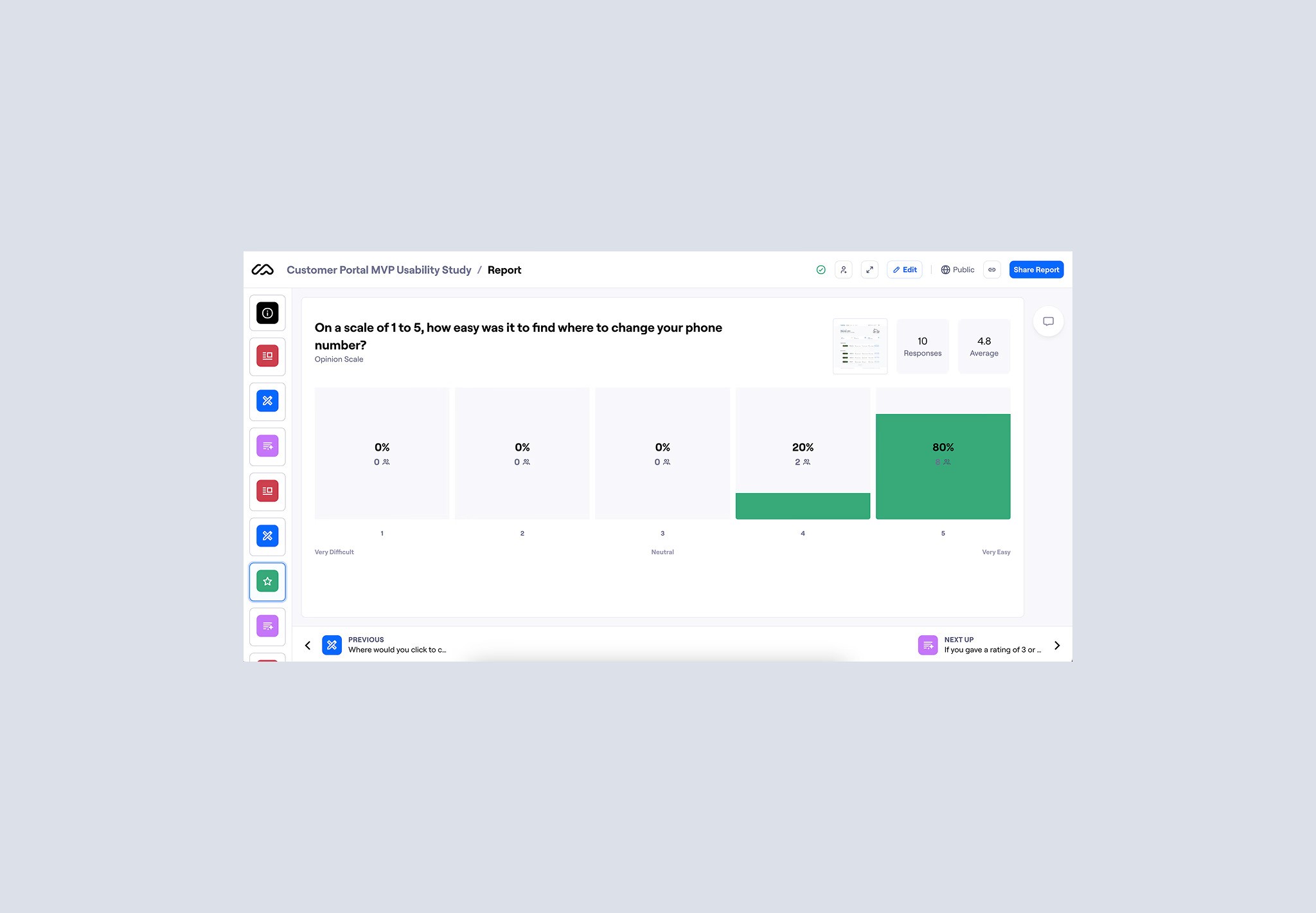
Users also rated the ease of finding contact info and account settings highly, with an average score of 4.8 out of 5.
Participants found the portal intuitive, with average ratings of 4.0 for locating past services and 4.3 for switching properties.
When comparing views for scheduled services, 9 out of 10 participants preferred the List view over the Calendar. This preference also aligned with how users interpreted and valued the account summary section, further reinforcing the simplicity and clarity of the list-based layout.
Test Results
Overall impressions were positive—8 out of 10 participants responded well to the transition from Mosquito Joe to Neighborly during login.
Task success was strong across the board: users had a 100% success rate completing key tasks like using the dashboard quick actions, navigating via the “Jobs” label, and switching between properties.
Users also rated the ease of finding contact info and account settings highly, with an average score of 4.8 out of 5.
Participants found the portal intuitive, with average ratings of 4.0 for locating past services and 4.3 for switching properties.
When comparing views for scheduled services, 9 out of 10 participants preferred the List view over the Calendar. This preference also aligned with how users interpreted and valued the account summary section, further reinforcing the simplicity and clarity of the list-based layout.
Outcome
Through continuous iteration and usability testing, we significantly improved the user flow and interface. After refining low-fidelity wireframes based on initial insights, we moved on to high-fidelity mockups and tested those again to validate visual design, language clarity, and interaction patterns.
Through continuous iteration and user testing, we significantly improved the user flow and interface. Clearer language, accurate data handling, and the inclusion of helpful features like pre-filled data and competitor comparisons led to stronger user trust.
Repeat users saw their saved personal details immediately, reinforcing security and continuity. Conditional logic ensured users only saw questions relevant to their tax situation, reducing cognitive load. As a result, completion rates increased, user confidence improved, and more users moved forward in the filing process.