Financial Services | E2E Design
Overview
The MyAccount portal at Santander Consumer USA allows customers to manage their auto loans—make payments, review statements, and access payment history. Stakeholders requested a redesign to modernize the interface, reduce call center volume related to website issues, and improve overall customer satisfaction.
Led the redesign of the platform, conducting user interviews and research to identify pain points. Reworked the information architecture, created prototypes, and delivered low- to high-fidelity mockups with a mobile-first approach.
Research
I began by conducting interviews and contextual inquiries with Customer Service Representatives (CSRs), shadowing calls to uncover frequent pain points around billing, AutoPay, and account access. These frontline insights, combined with call log reviews and analytics, helped prioritize issues and highlight that most users accessed the portal via mobile.
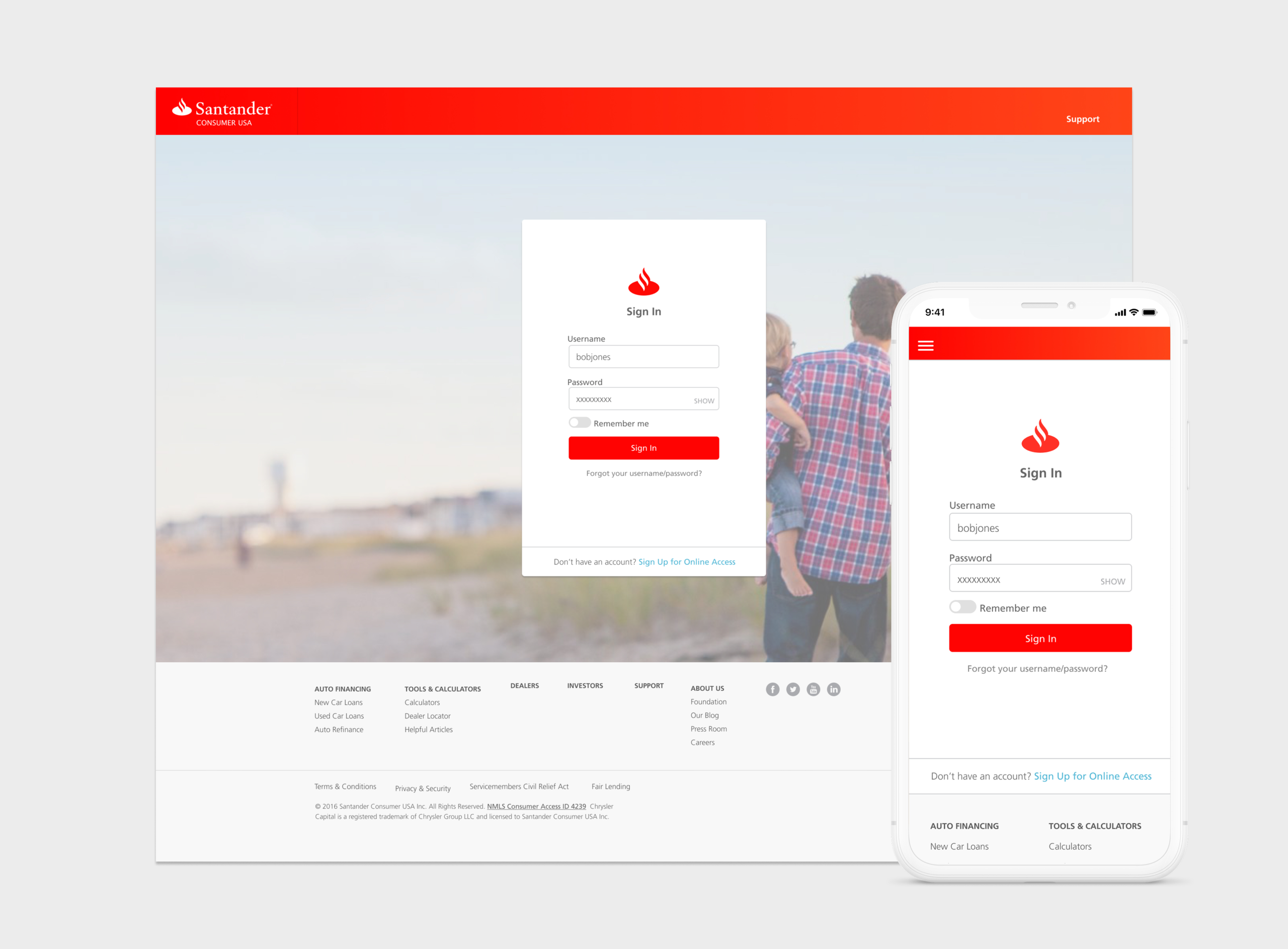
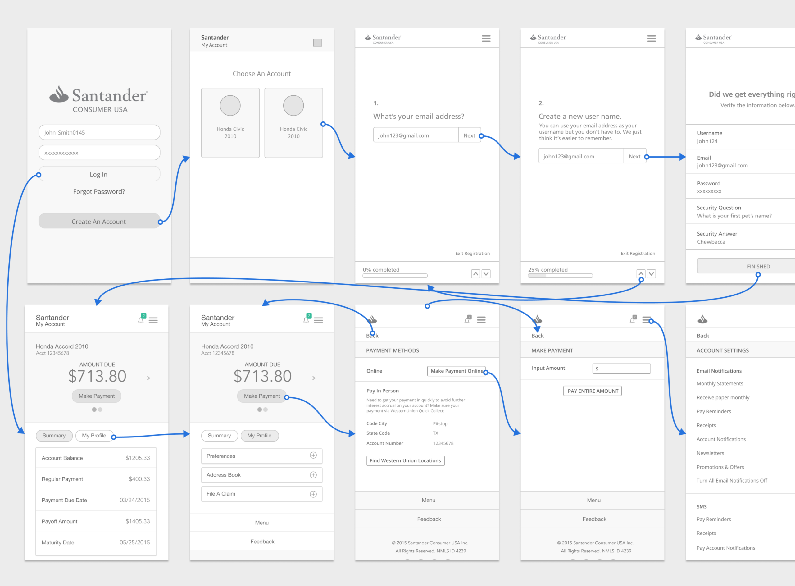
Using these findings, I reworked the information architecture, then created low-fidelity wireframes to test navigation and workflows. These evolved into high-fidelity, mobile-first mockups that refined both authenticated and unauthenticated experiences, including streamlined Sign-In and Create Account flows..
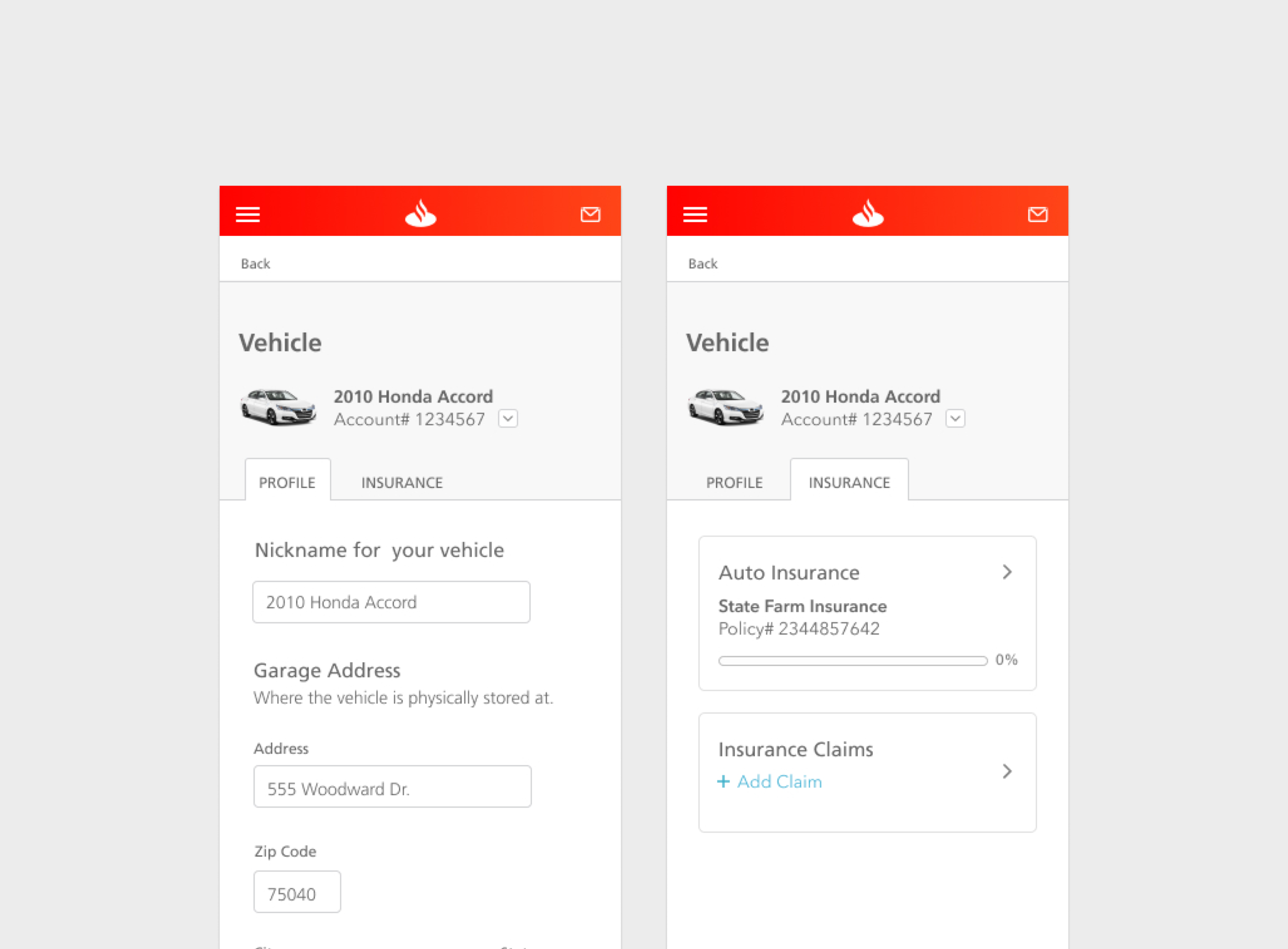
Shifting to a Mobile-First Experience
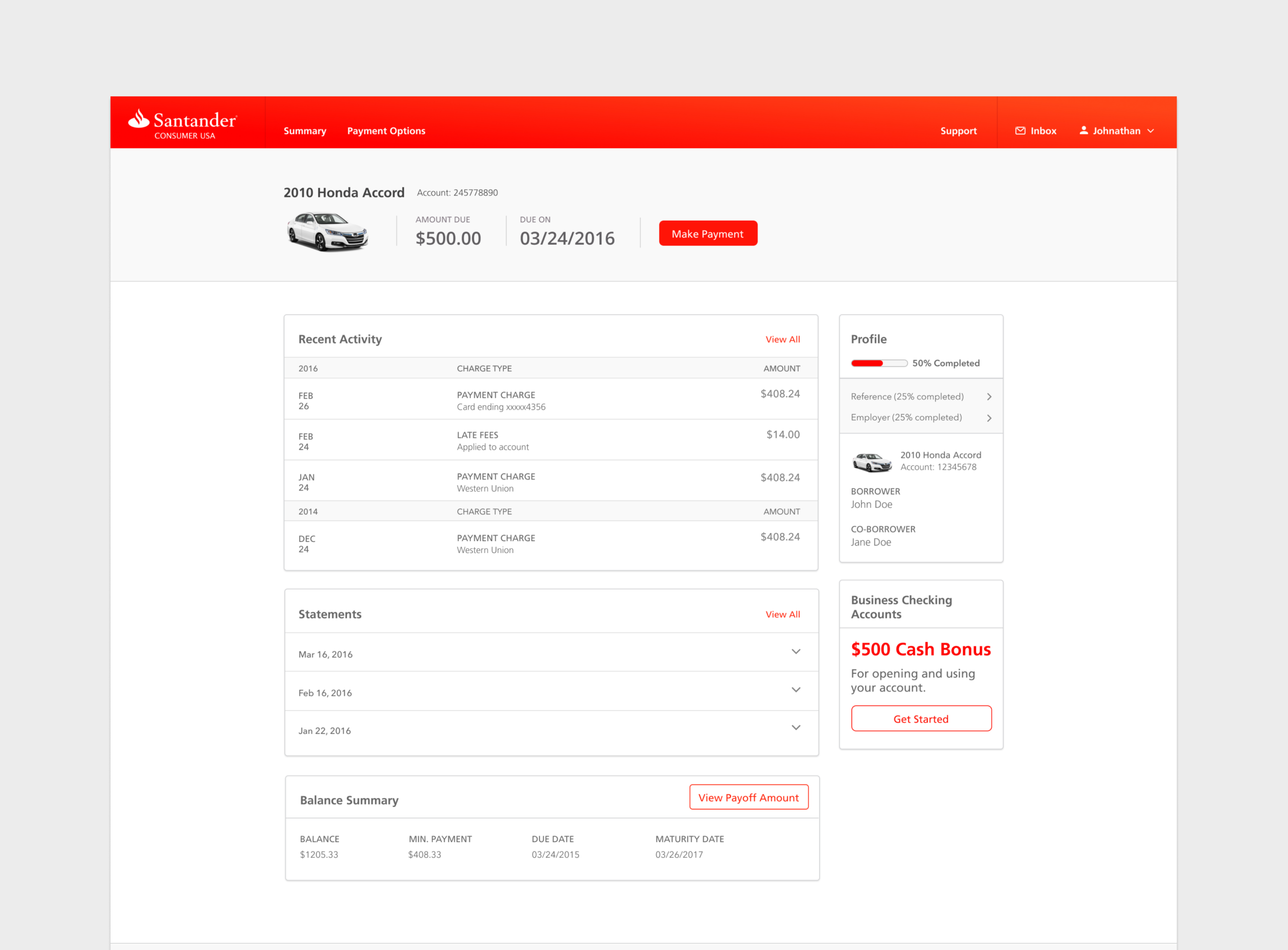
Seeing that about 60% of users were visiting the portal on their phones, we moved to a mobile-first approach to make sure the experience worked where customers actually were. This meant prioritizing key actions, simplifying layouts, and designing for clarity on smaller screens first.
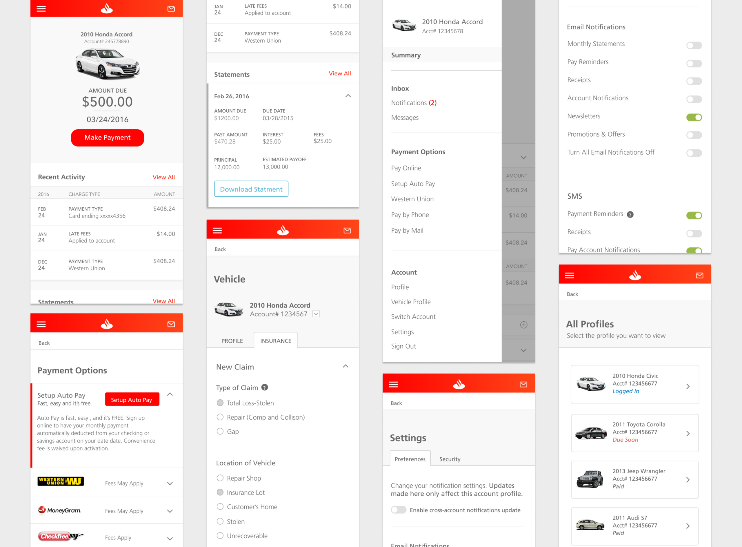
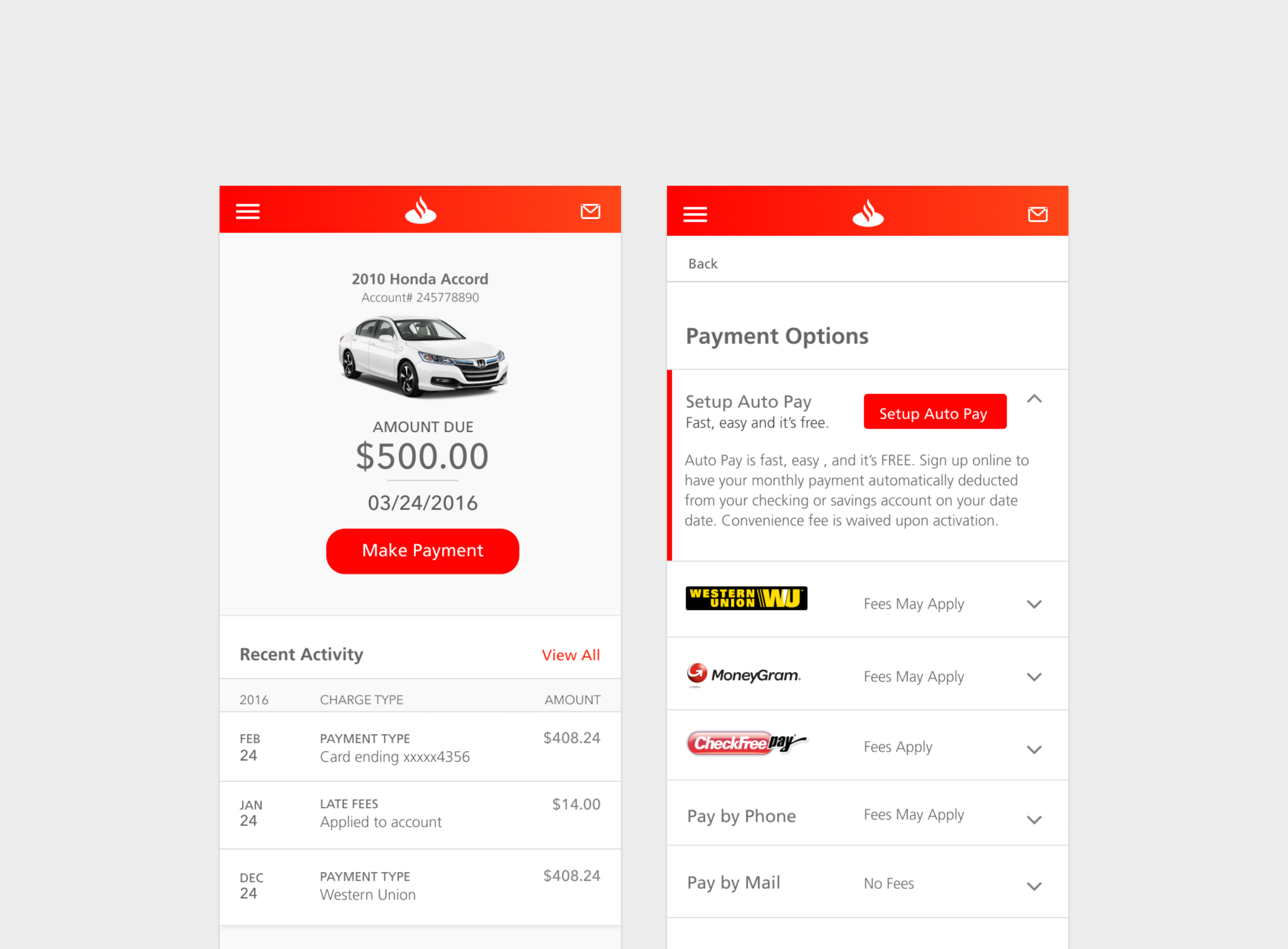
We also reworked the onboarding flow to make it easier for new users to get up and running without friction, and redesigned the dashboard to focus on what users cared about most—making payments and understanding their account. Supporting content like offers was moved into a clearer sidebar so it didn’t compete with primary tasks.
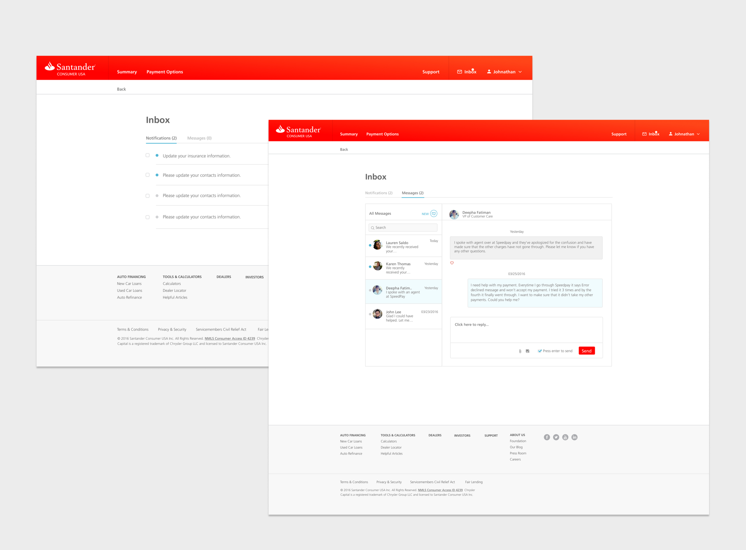
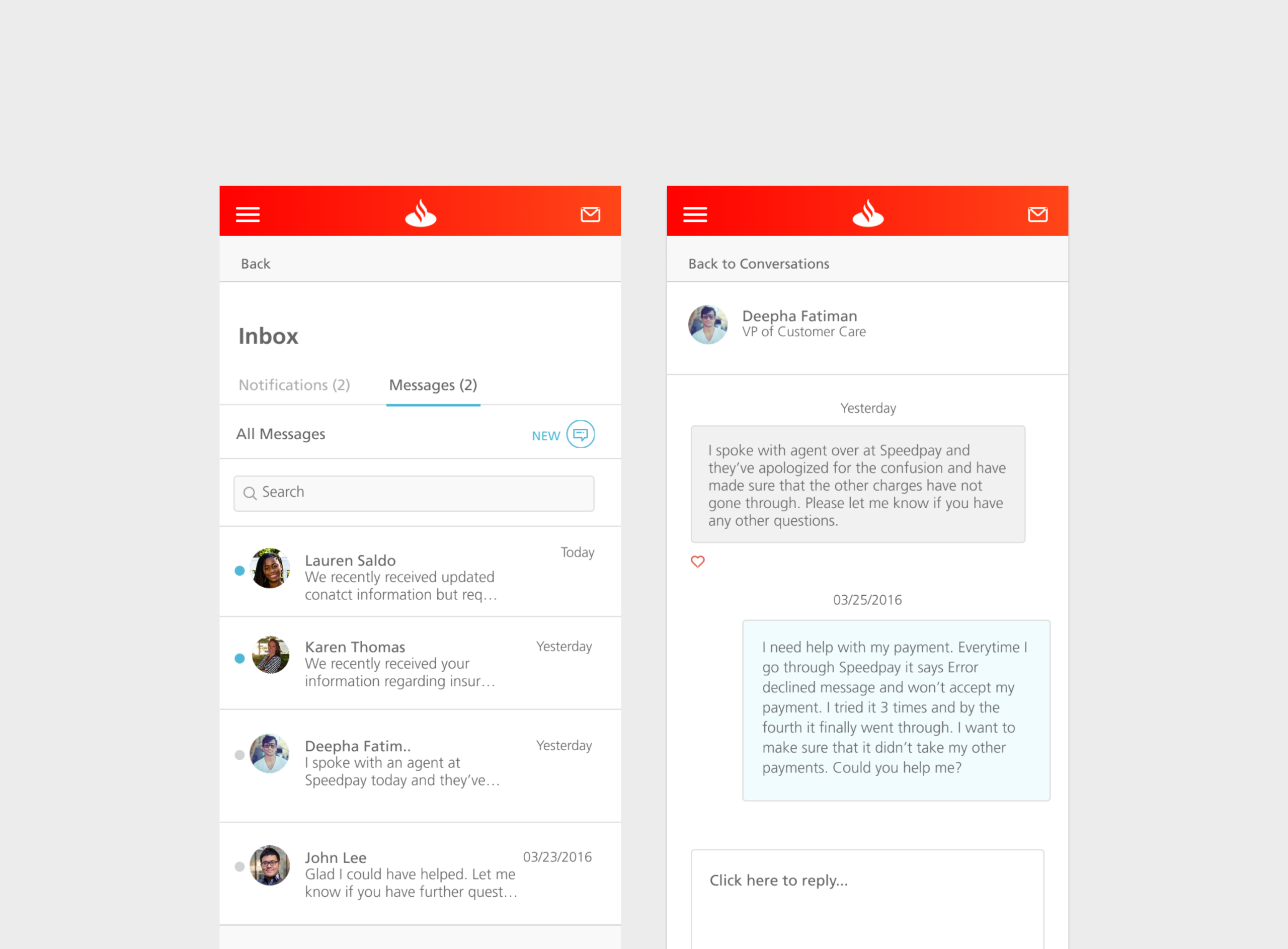
Customer Support
A big part of the redesign focused on reducing customer frustration and support dependency. Previously, the portal relied almost entirely on phone calls for help—there was no in-product way to chat or self-serve common issues. As part of the redesign, we introduced in-portal chat, giving customers a faster, lower-effort way to get support without leaving the experience.
By making help accessible directly within the portal, we saw a noticeable shift away from phone calls. Support data showed a meaningful drop in call volume (≈20–30%) for common account and billing questions, helping reduce wait times while giving customers more control over how they got help.
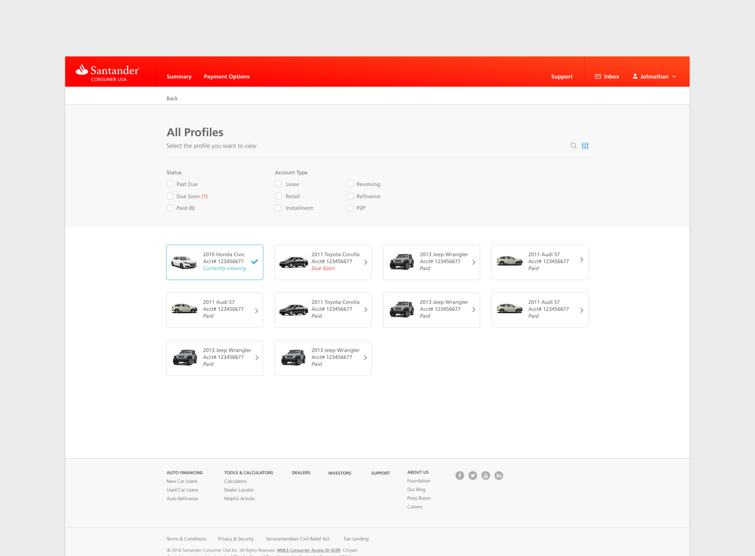
Removing Friction for Multi-Account Users
Another major source of support calls came from customers who managed multiple accounts, especially commercial users. Previously, switching accounts required logging out and logging back in—an unintuitive and time-consuming process that frequently led to confusion and support calls.
We redesigned this experience by introducing a simple account-switching feature, allowing users to move between accounts seamlessly within the same session. This dramatically reduced friction for power users and addressed one of the top reasons customers were calling support in the first place.
Outcomes
The redesigned MyAccount portal delivered a more intuitive, mobile-optimized experience that directly addressed frequent customer pain points. By reorganizing content, simplifying key tasks, and improving usability, the new design helped reduce friction, aligned with branding standards, and laid a foundation for fewer support calls and higher customer satisfaction.