Home Services | E2E Design
Overview
Neighborly has 20+ home-service brands, each running on its own POS system—which meant customers juggling multiple logins, payment methods, and service histories. If you used more than one brand, managing your account felt less like “one Neighborly” and more like a scavenger hunt. Our challenge was to turn this fragmented experience into a single, simple place customers could actually enjoy using.
MVP
Mosquito Joe was the first brand to migrate, and we launched the MVP in just five months—from February to July—with the added goal of pressure-testing what it would take to integrate a single franchise POS before scaling to the rest. Along the way, we navigated shifting priorities, evolving requirements, and a few leadership changes, while still moving fast, iterating often, and measuring performance. By June, we introduced upsell features and onboarded 250 users.
To make sure we weren’t designing in a vacuum, we interviewed 10 customers across Mosquito Joe, Molly Maid, and Mr. Handyman. We explored how they pay for services, what they expect from a customer portal, what frustrates them about invoices, and whether they recognize or trust the Neighborly brand. Those insights helped validate MVP priorities and kept us focused on the fundamentals—clear payments, thoughtful brand onboarding, and dashboard content that’s actually useful.
Post MVP
After validating the MVP with Mosquito Joe, we moved to a staggered rollout across additional brands rather than launching all at once. This approach helped us manage risk, pressure-test each franchise POS integration, and apply learnings incrementally as we scaled. Each brand rollout informed the next, allowing us to move fast without sacrificing stability or repeating early mistakes.
At the same time, we evolved the product into Version 1 by focusing on usability and approachability. We ran usability studies to uncover friction, validate navigation, and understand where customers felt uncertain. Those insights drove UI refinements—simpler layouts, clearer hierarchy, and more intuitive language—resulting in a friendlier experience that made core tasks like payments and account management easier to understand and complete.
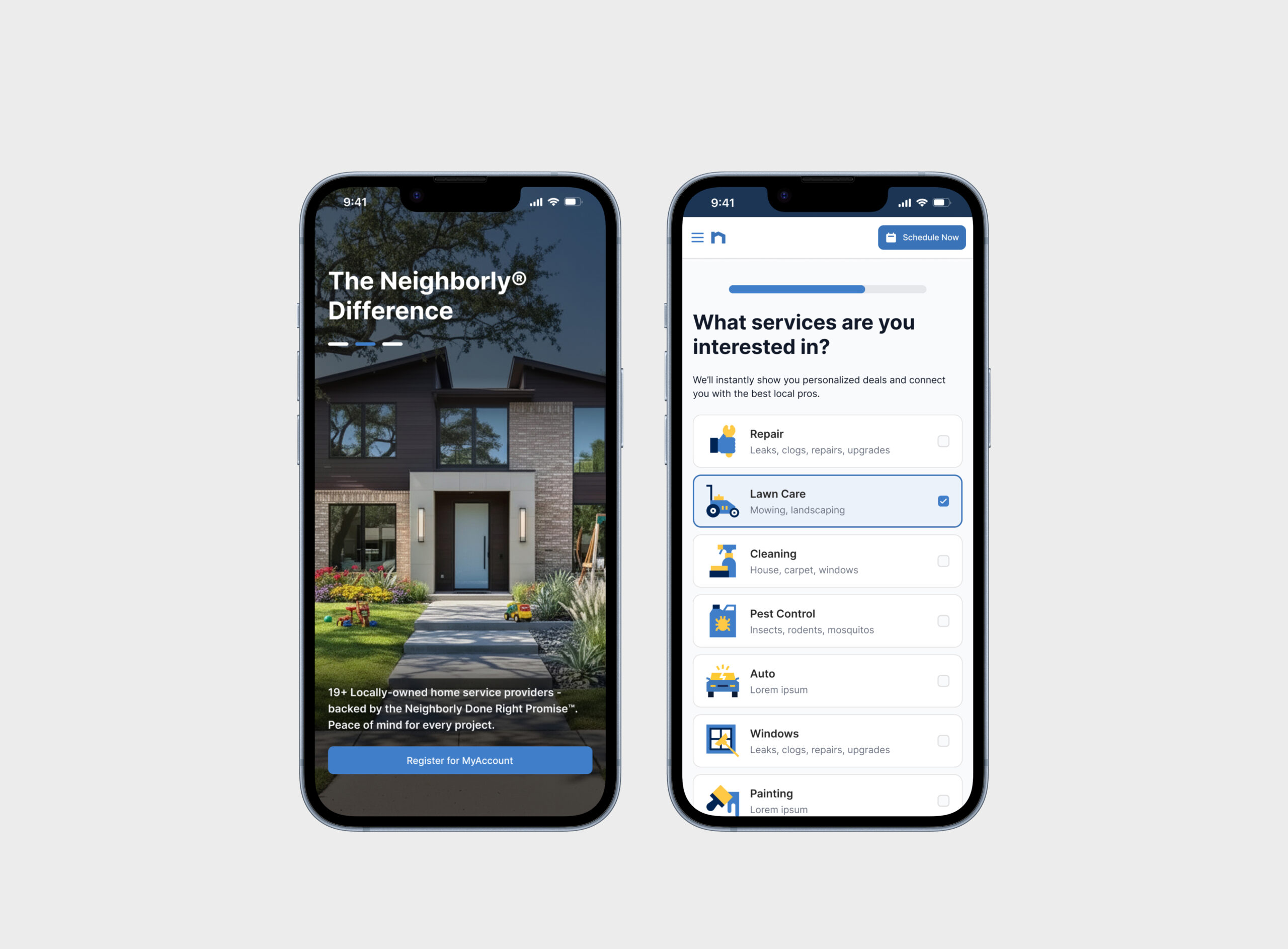
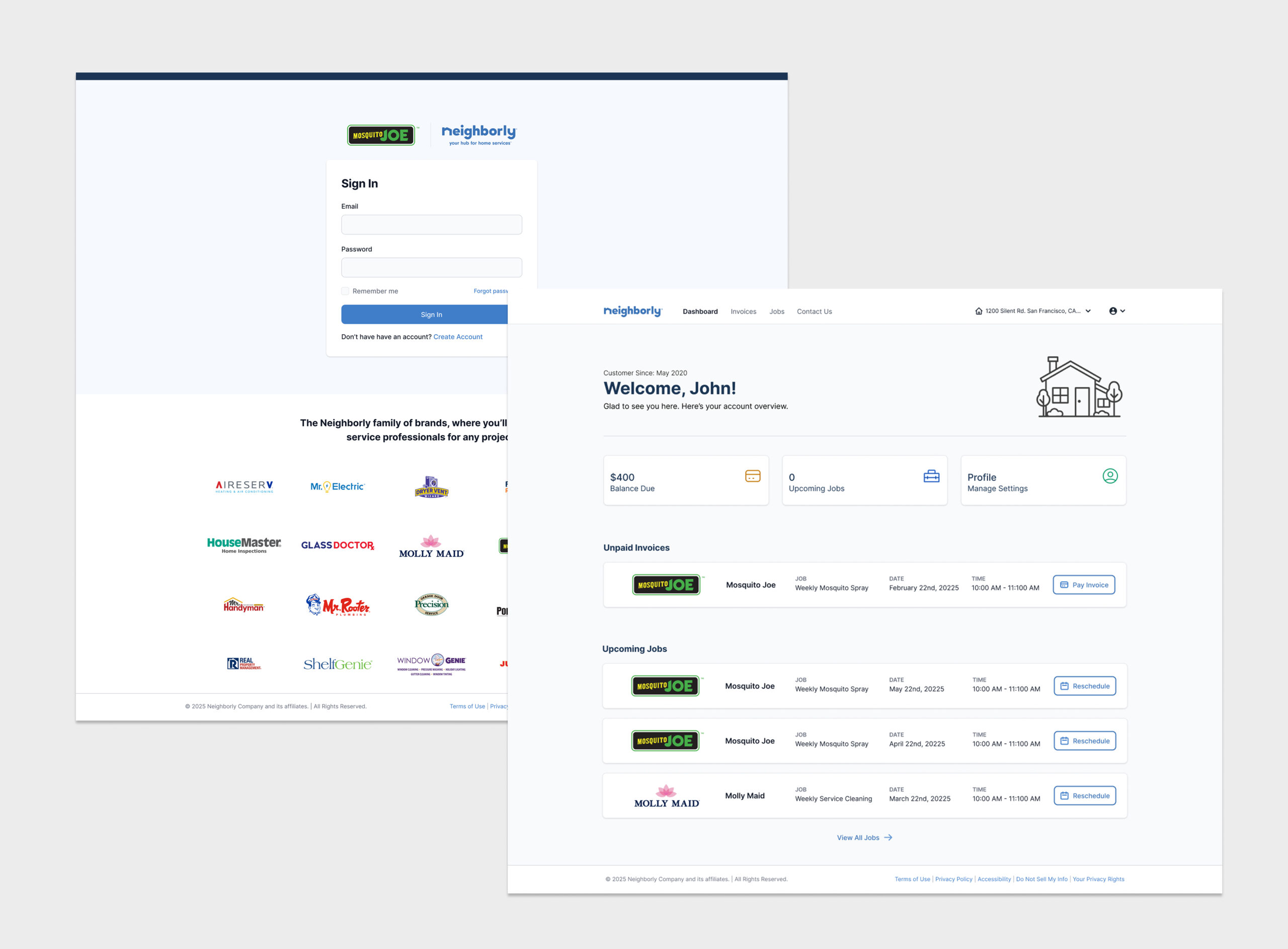
Create Account & Onboarding
The Create Account experience was redesigned to support customers coming in directly from Neighborly.com, making it easy for new visitors to register—not just existing service customers. We intentionally kept the flow lightweight and low-friction, collecting only what was necessary while clearly setting expectations for what the portal offers. An onboarding layer was added to help first-time users understand key features and feel oriented right away, instead of being dropped into an unfamiliar dashboard.
From there, account creation became the entry point to a broader Customer 360 view. Registration and onboarding captured brand context, opt-ins, and early behavioral signals, helping power more relevant communication and personalization across brands. This reduced noise, improved engagement, and created a more connected experience that becomes more valuable the longer a customer uses the platform.
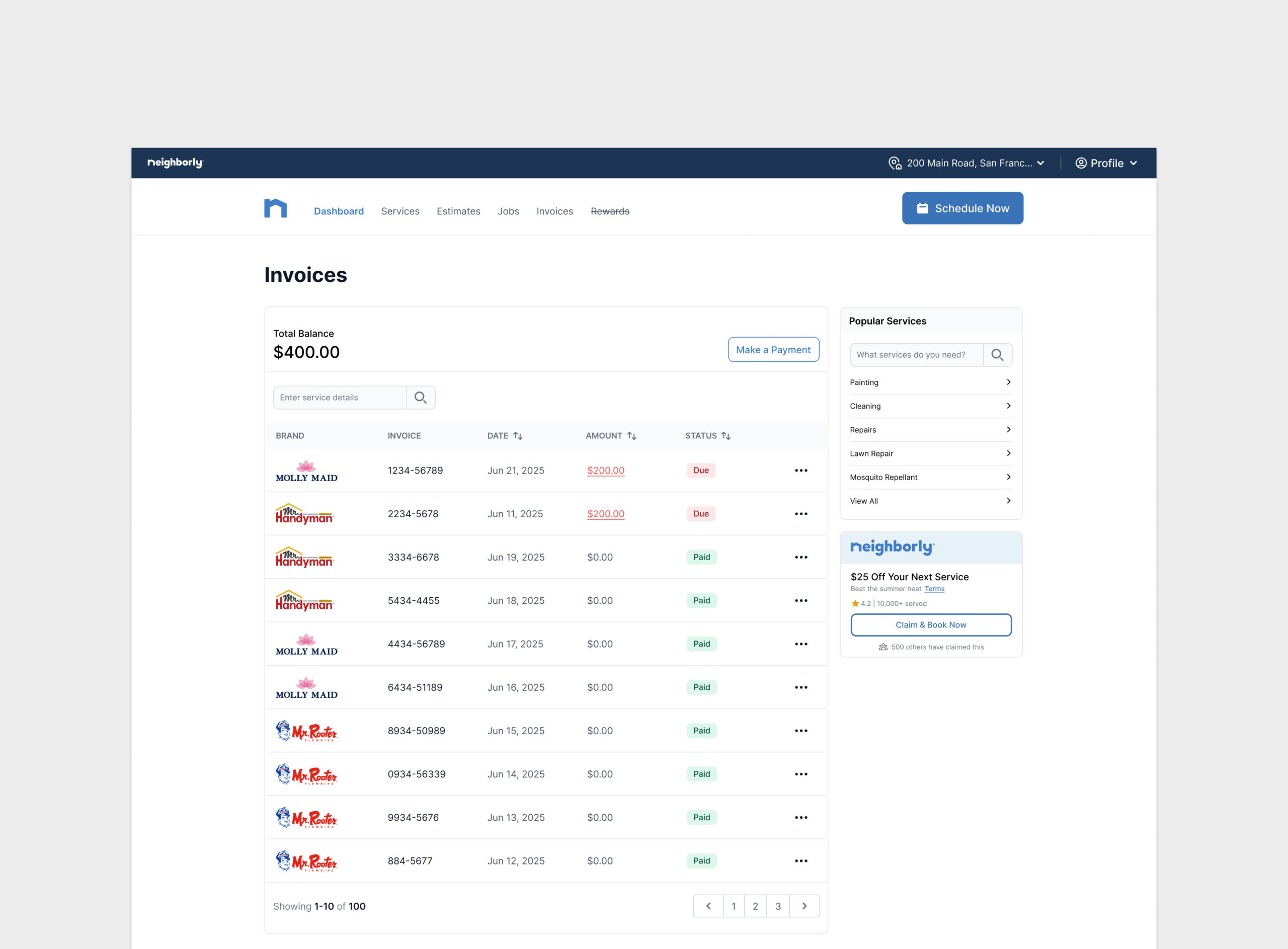
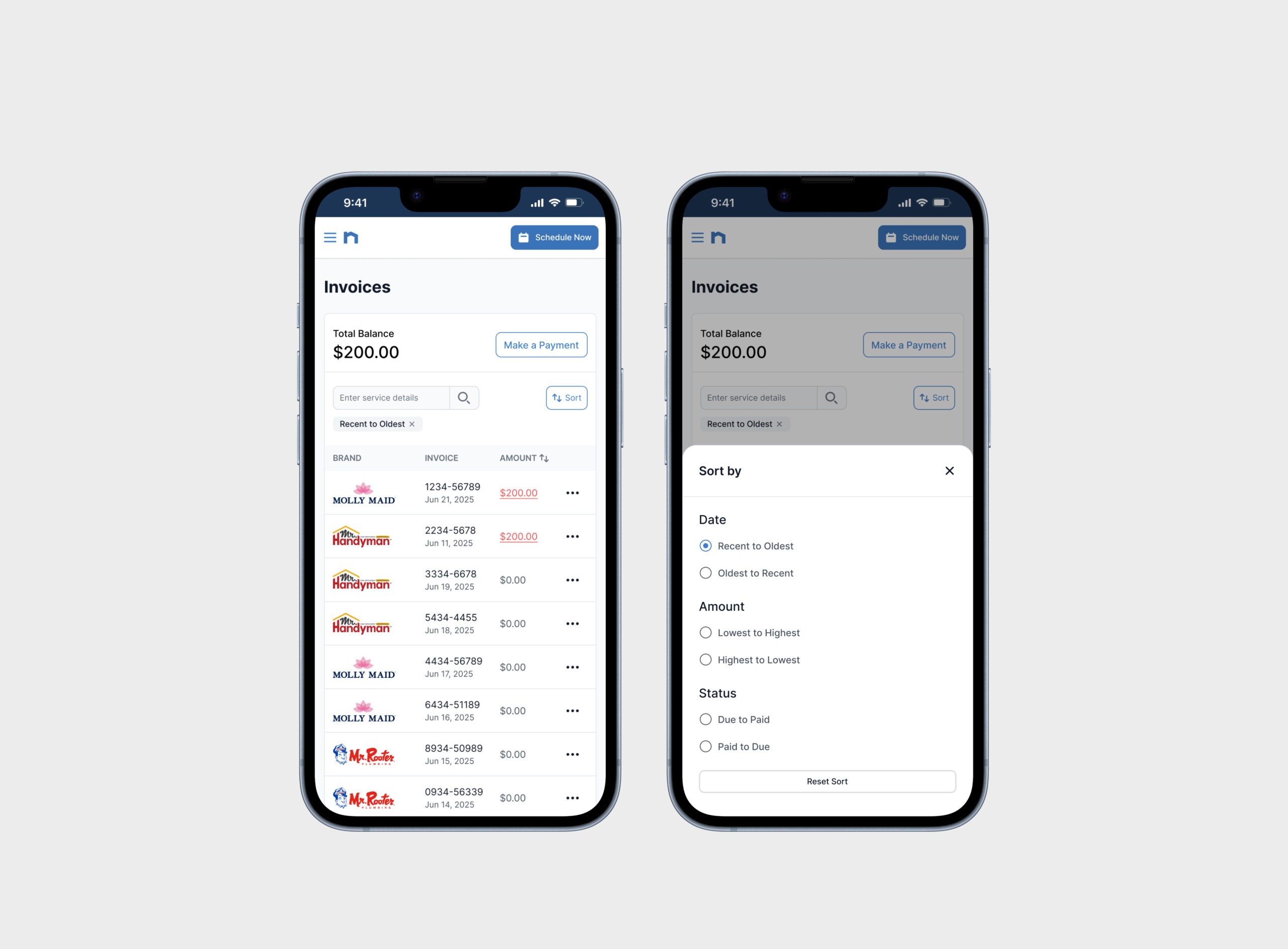
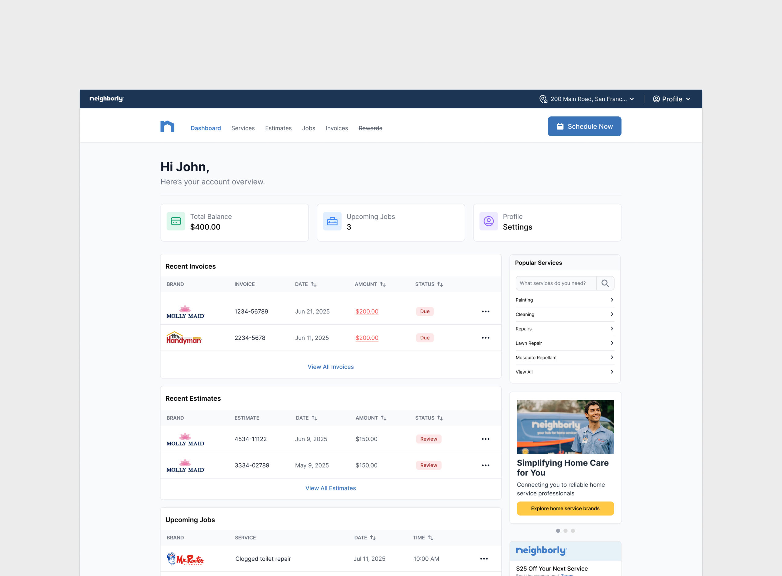
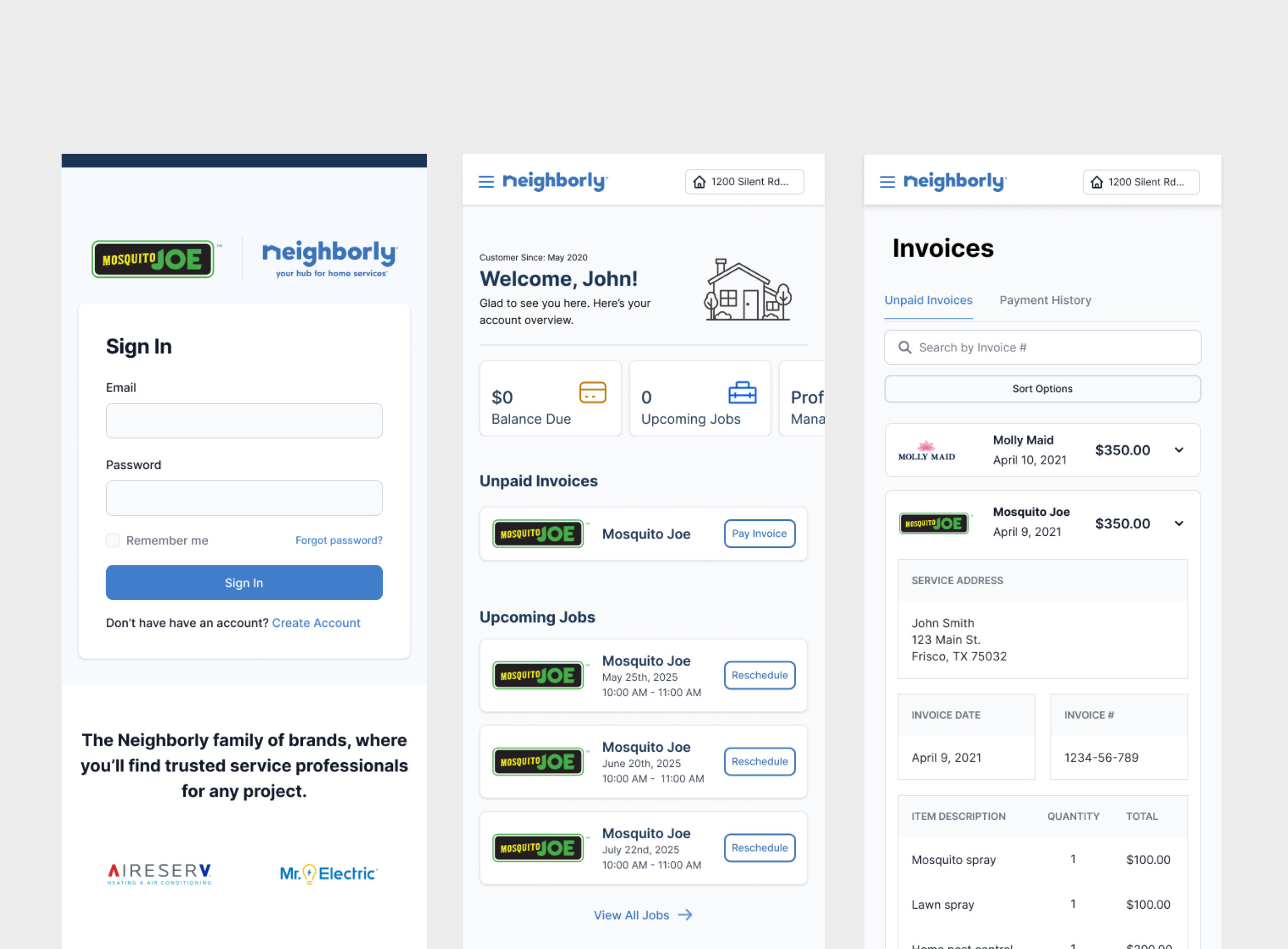
Invoices & Payments
The invoices page had to work across multiple brands without turning into a Frankenstein of styles and rules. We designed it to be brand-agnostic at its core, with flexible theming that adapts to each franchise while keeping layouts and patterns consistent—so users always know what they’re looking at and what to do next.
Clarity was the top priority: clean line items, clear statuses, and obvious actions, because invoices are already stressful enough. A right-side panel surfaces relevant upsell and cross-sell opportunities based on brand and service history, staying out of the way when users just want to pay. Behind the scenes, the structure was built to scale—supporting new brands, payment rules, and future enhancements without redesigning the page every time a new POS comes online.
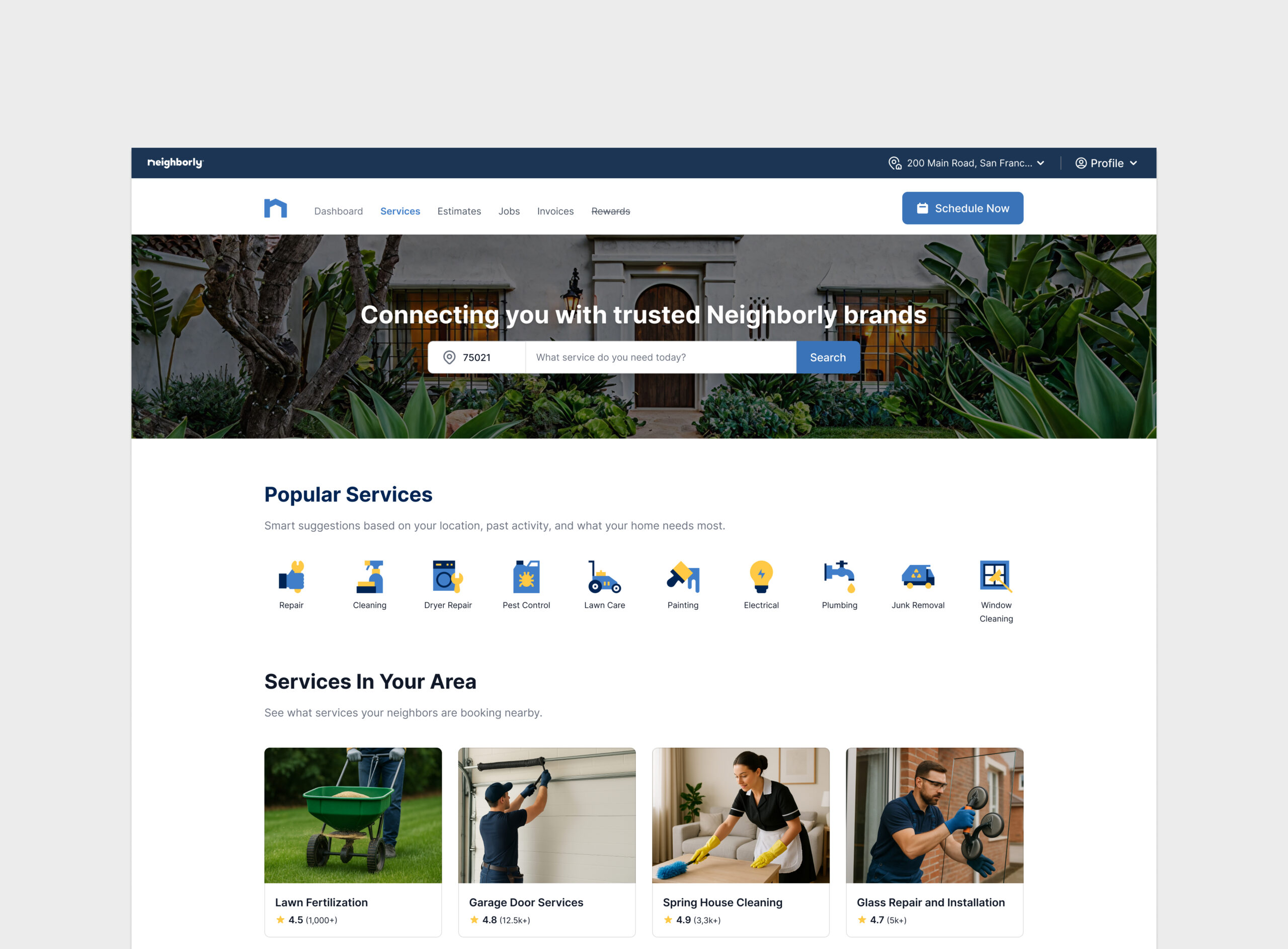
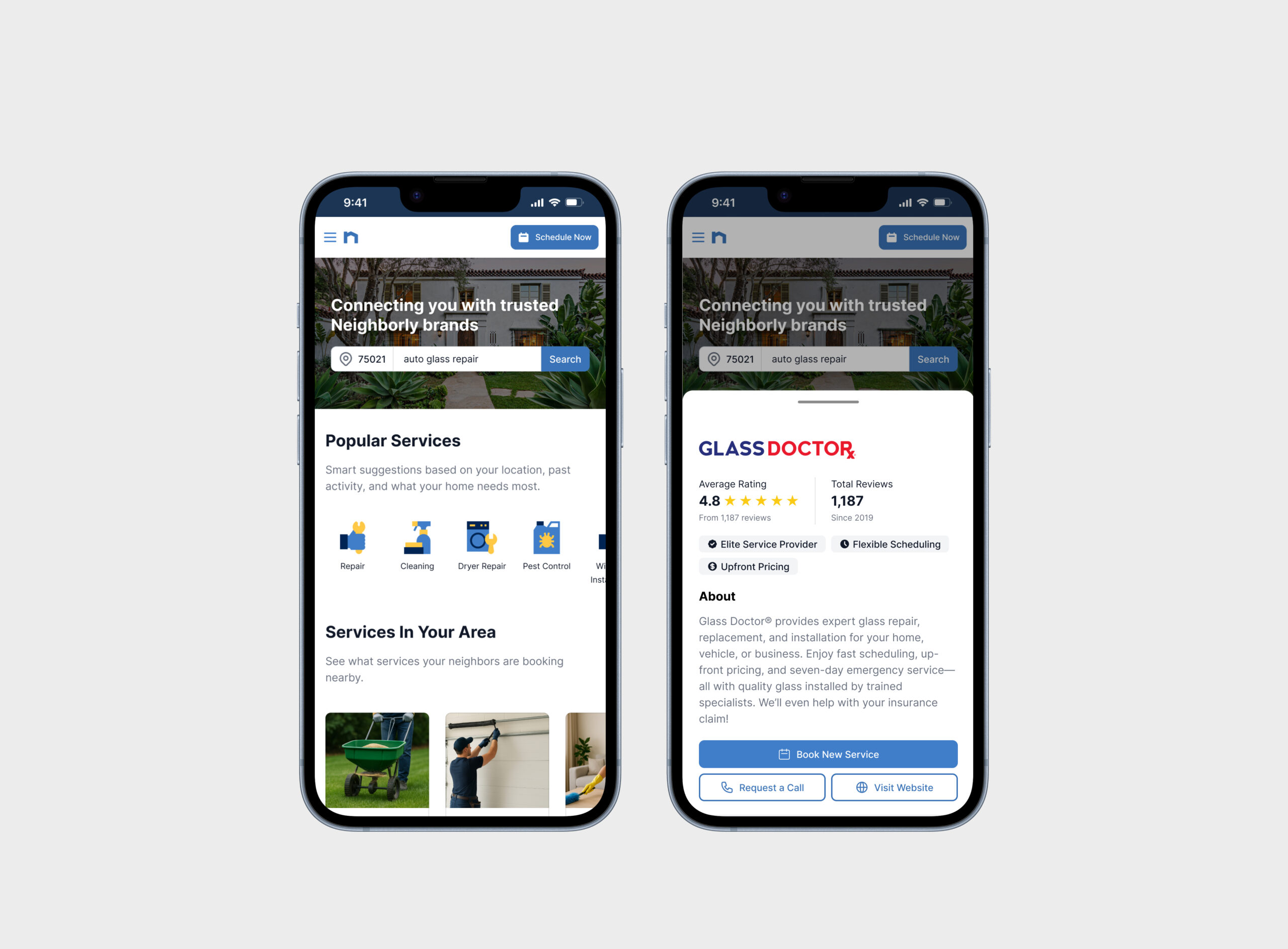
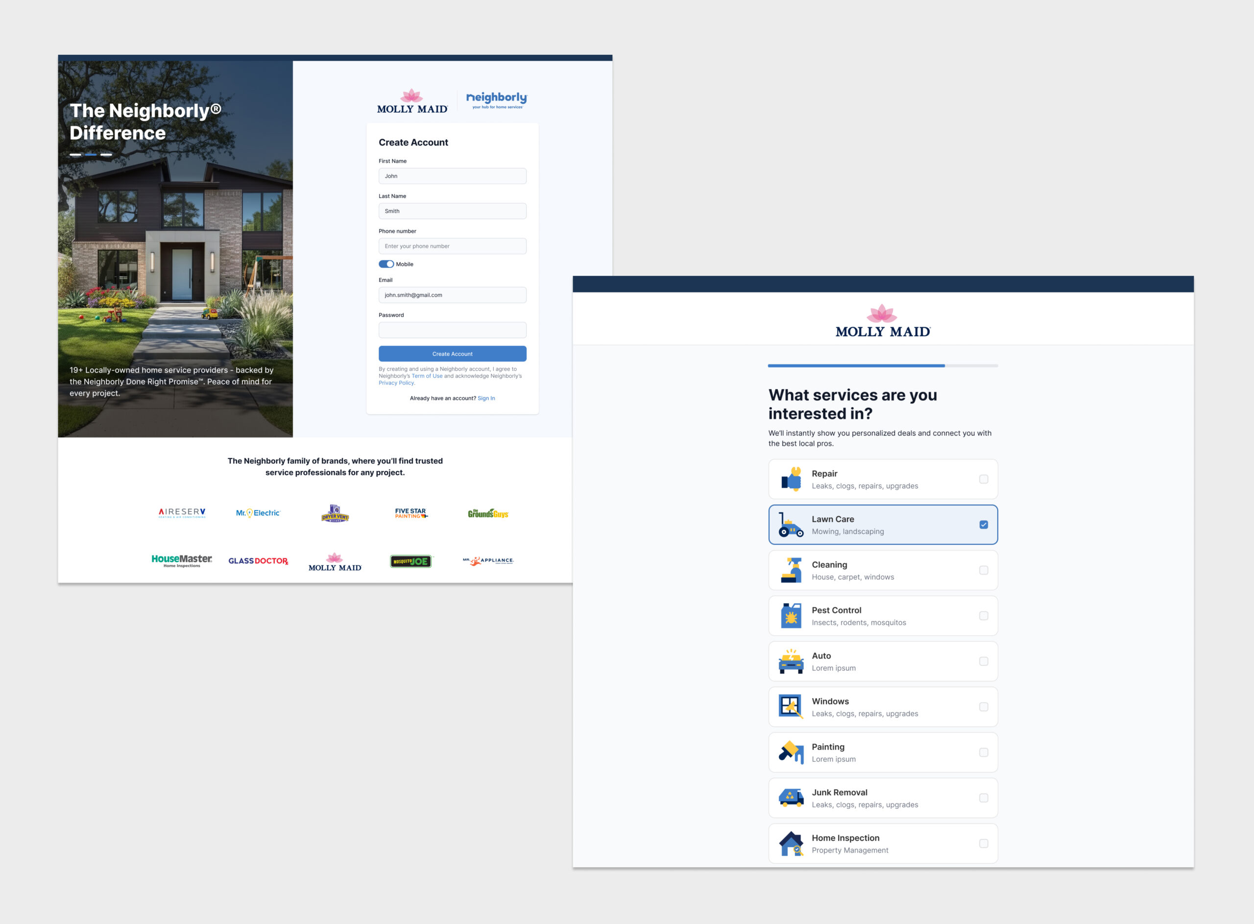
Services
One of the biggest debates was whether to organize the Services page by brand or by the services customers actually need. Internally, brands felt like the obvious choice. Externally, customers made it clear they think in problems, not logos—“I need my lawn treated,” not “Which brand does that again?” Convincing leadership, stakeholders, and brand presidents of this required research, not opinions.
Customer interviews and usability studies consistently showed users scanning for services first. When grouped by brand, people hesitated and made wrong turns; when services led the experience, tasks were faster and clearer. The final design surfaces services first, with brand context layered in where helpful—aligning the portal to customer mental models instead of internal org charts.
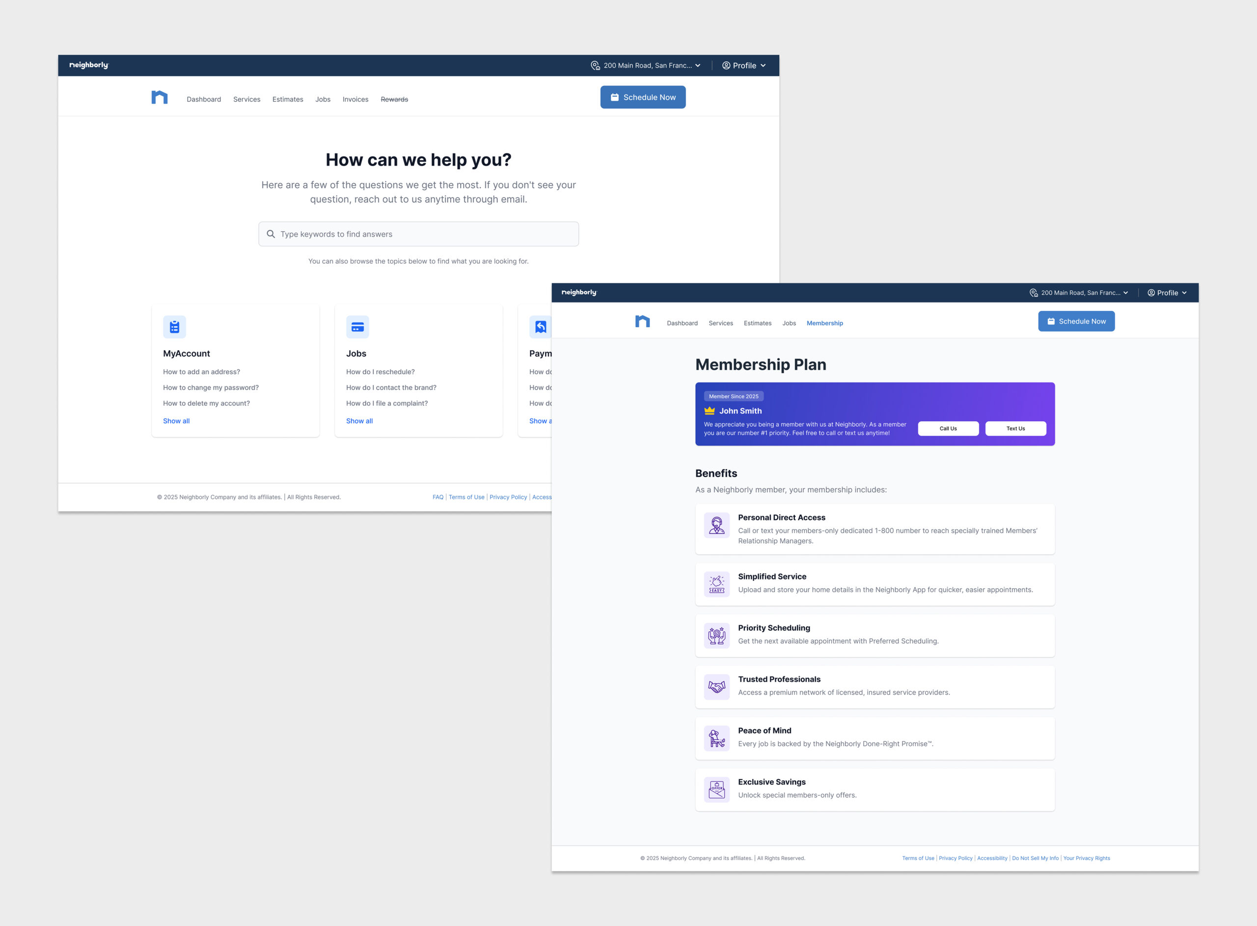
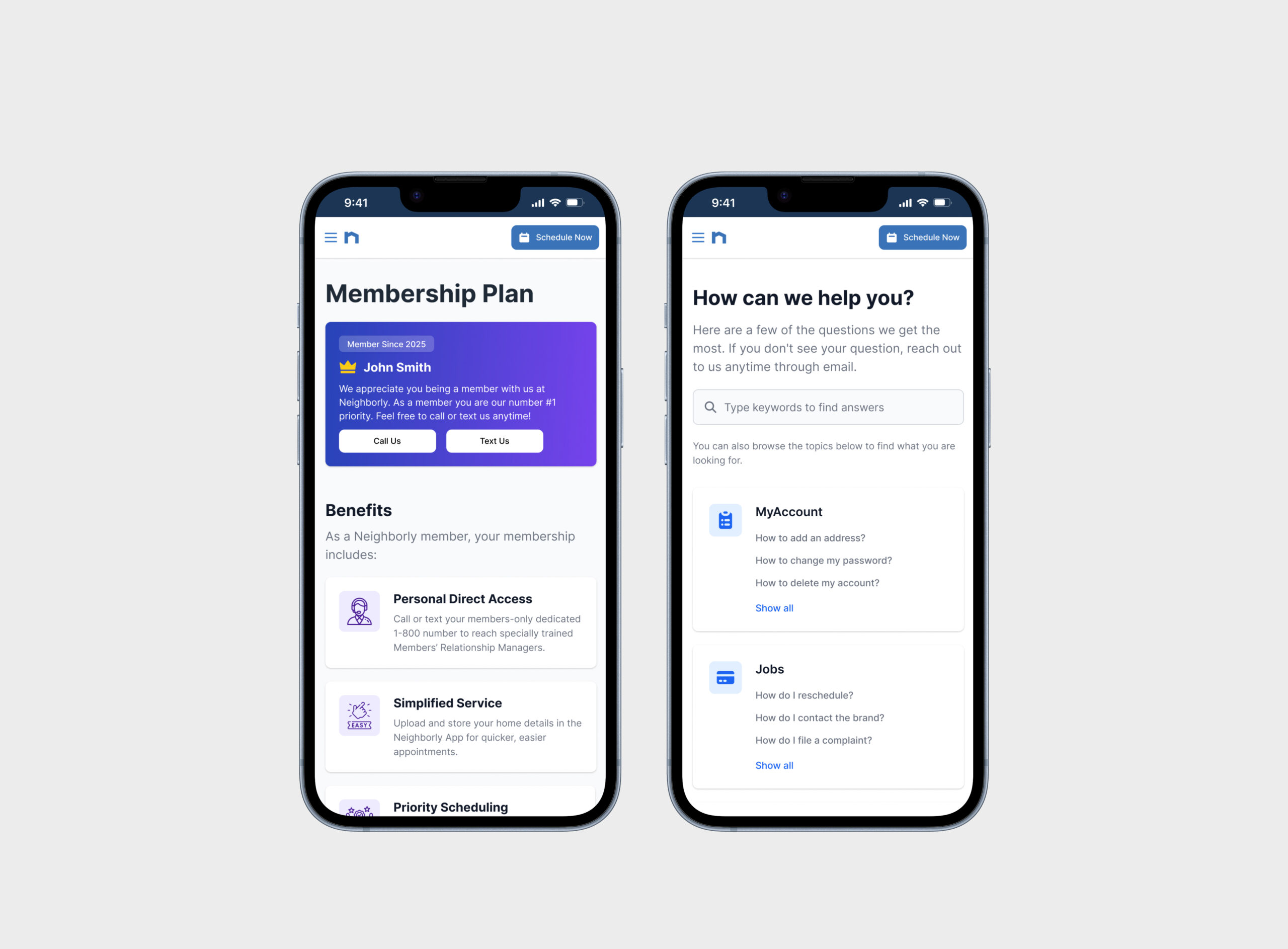
Membership Plans
The first step of the Membership Plan was intentionally simple: customers were automatically enrolled so they could start seeing value right away without signing up for yet another thing. This let the business introduce membership benefits in a low-friction way while helping customers understand what being a “member” actually means.
The experience focused on clear, immediate perks like preferred scheduling, relevant offers, and service-related benefits—no paywalls or commitments upfront. At the same time, it was designed to scale into future paid tiers with expanded, cross-brand benefits, laying the groundwork for monetization while building trust first so upgrades feel natural, not forced.